Case Study for Dog Walking App


Graduate of the Dribbble Product Design Course
Role: Product Designer
Responsibilities: Research, User Experience, User Flow, Visual Design, Prototyping
Design Brief
The goal of this Dog Walking product design was to create an easy-to-use application for dog owners that helps to establish trust and communication with a dog walker. The target market for this application is people over the age of 50 that do not use or understand how to use an application on their device.
Problem Statement
Dog owners over 50 who work a lot, own their businesses, don’t have flexible schedules, or work too far from home may have trouble taking care of their dogs during the day, especially for dogs with special needs. These dog owners do not have friends or family near who can walk their dogs throughout the day. This application will address this problem by helping owners find trustworthy people to walk their fur babies when they cannot. This application makes the whole process easy and quick.
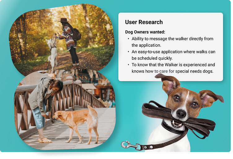
User Research
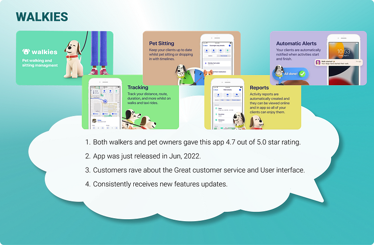
Market Research
For the market research, I looked at two other applications: Rover & Walkies! Both applications are top-rated with several different features, such as video meet-n-greets, in-app messaging, GPS tracking, different levels of walks, pet sitting, and reports.
I found there is a lack of trust and frustration from the users. Dog owners lack confidence that the selected walker would even show up. They also had concerns about walkers canceling on them at the last minute. Dog walkers wanted to ensure that the Dog Owners were safe and verified.

Persona
Mary owns a flower shop and takes her dogs to work with her. She finds it hard to leave the shop to walk her dogs multiple times a day. Her shop is in a college town, so finding a walker is relatively easy. She wants an app that is easy to use with the ability to message the walker directly from the app.

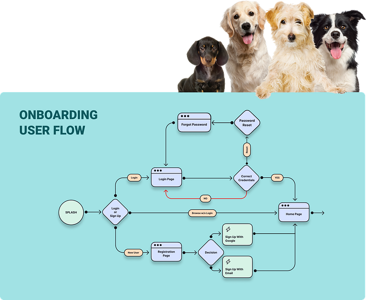
User Flow
When creating the User Flow, I wanted to make it as easy as possible for the end user to set up an account, Login to their existing account, or browse walkers. This flow allows ease of use for the end user without providing too much information at the beginning of the application.
Users start at the home page, where they can freely browse without logging in. Users can then decide to either log in or sign up. If the user selects sign up, they will be directed to the Registration form, where they can either sign up with their Google account or Email. Once they have successfully registered, they will be taken to the Home page.
Existing users can click login to be directed to the login page, where they can enter their credentials. If credentials are incorrect, they are redirected back to the Login page or can choose “Forgot Password” to reset their password and be redirected to the login page.
If credentials are correct, they will be directed to the Home Page where they can search for a dog walker.

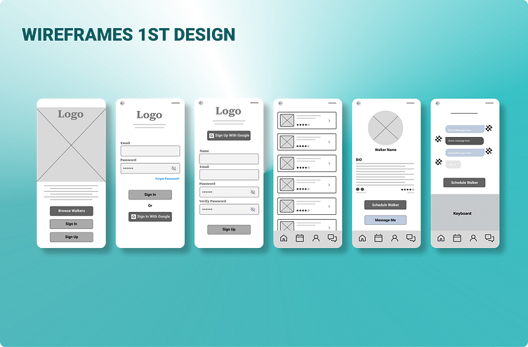
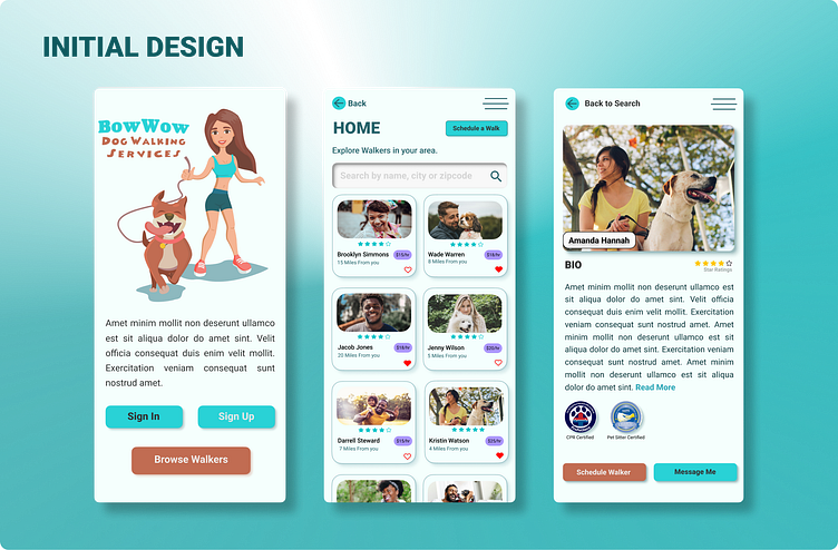
Wireframes
The main goal of the wireframe was to create the onboarding section of the application keeping it quick and easy to use.
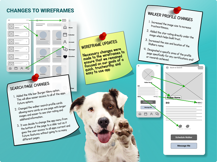
After completing and reviewing the first round of wireframes, I decided that a few changes needed to be made to the Walker Search page and the Walker Bio page.
The following issues were identified and changed.
1. The Dog Walker Search page required a large amount of scrolling, had no search area and did not convey trust. I added a search bar and created smaller profile cards that provide the walker's image, star rating, and location/distance. This allows the user to scroll through more profiles faster and immediately get the information they are looking for.
2. The Walker Profile page did not convey trust, so I made the profile picture larger and brought the star rating directly under the image. I also included an area specifically for the walker's certifications.
3. In-app messaging is highly critical for this design as it builds trust and the ability to contact the walker directly from the app without providing the walker’s personal information at the start of introductions.

Visual Design
The feedback I received for the initial design was that the colors, logo, splash page image, and overall look and feel came off as too cartoony and not an application that should build trust with the end User.
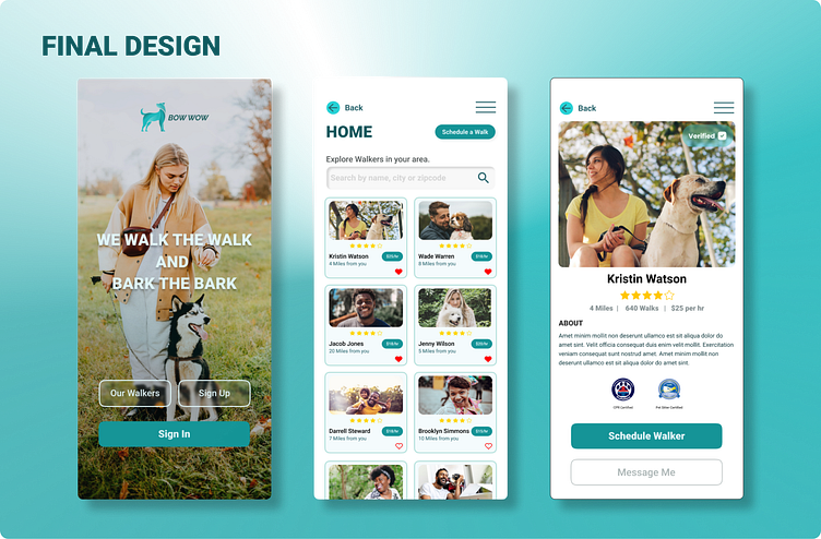
I took this feedback and came up with a much better design overall. I adjusted the colors to make it warm and welcoming, created a new logo, adjusted the buttons, and made sure that the pages flowed better, all while ensuring that the app remained easy to use and quick to get through.
Prototyping
I conducted two User Acceptance tests. In the first test, a few items were not considered and needed to be addressed. The score for the first test was 44/100.
The Users found the following issues:
1. Splash Page needs polishing up.
2. No Keyboard appears when clicking in the User Fields.
3. Google Sign-up does not work.
4. Testers were unable to schedule a walk. User’s felt this was a crucial feature that needed to be available in the first iteration.
I took the initial test results and made multiple changes to the app for the second test. The splash page received a facelift based on the user's suggestions. I also made the buttons smaller and less clunky, making the overall appearance more pleasing.
I also made the following changes based on feedback from the testers and what I felt needed to be done.
1. Included the Keyboard feature when a field is clicked.
2. Activated “Forgot Password” and kept it simple for the time being.
3. Activated the “Connect with Google” Button.
4. Most importantly, I activated the schedule a walk buttons since this is a crucial feature of the App.
Both testers enjoyed the updates and the overall look and feel of the design and gave the final test a score of 100/100.
To run through the prototype, you can click here.
Outcome
The overall project was great to work through, and I learned so much. I come from a development background, so being able to design a working app from the start gave me a clearer picture of the processes needing to take place before the design is handed over to development.
I aim to put all my skills to work and create unique products, websites, and graphics. This is the next step in my career and a field I have been passionate about for a long time. This course allowed me to focus on what I want to do and where I want to go in my career.