DJ Anu Logo Design with Golden Ratio

Behind the scene
This logo is designed For DJ Anuradha. If I talk about the logo, these were Anuradha's requirements.
1. The three letters D J A (Anuradha) should be symbolic.
2. Logo color should be yellow.
3. It should be a great design like you did before.
4. His favorite logotype is the logotype of Alan walker.
I went to work keeping those things in mind. When I started to design the logo, the same thing ran through my mind. There is no such thing as sitting in one place and sketching for hours and hours. I sketch for a while and do other work for a while. When I do that, I come up with different ideas about the logo. finally We selected a sketch and started developing it.
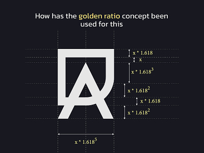
What's special about this is that I applied the golden ratio to this and it turned out better than I thought.
Usually, people have asked about the time it takes me to make a logo. It took about 3 hours to make this logo. That was only the time when I was in the laptop. if I take it with the sketched time, it is difficult to calculate the exact time. It takes at least three two days to design one.
Anyway, the final output is here. You can get an idea about the shape from the logo guidelines.
D and J are combined into one shape and another shape is made by the letter A and arrowhead. Both shapes are combined and the logo is completely created.
This logo symbolizes that the DJ Anuradha brand is ready to take the enjoyment of the fans to the peak point of the maximum enjoyment that a fan can get through the art of DJ music.
Are you interested in working with us ?
Feel free to reach out via the Dribbble inbox or direct e-mail: