Smart Home App

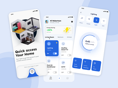
The home page displays the list of rooms and devices. The second screen displays a toggle for switching the light, and scales for setting light brightness, intensity, and schedule.
We thought the black and blue palette works well for the smart home app because it looks stylish and modern. Moreover, the contrasting palette highlights the functionality of the app. Our goal was to make the smart
Home app simple and intuitive to use. What do you think, nailed it?
Show us love! Press "L".
Want to see more projects? Visit Behance and follow me!