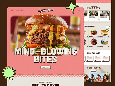
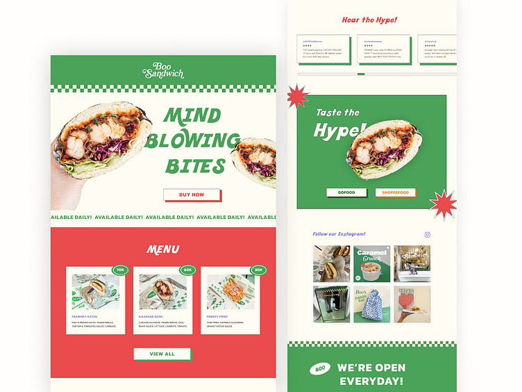
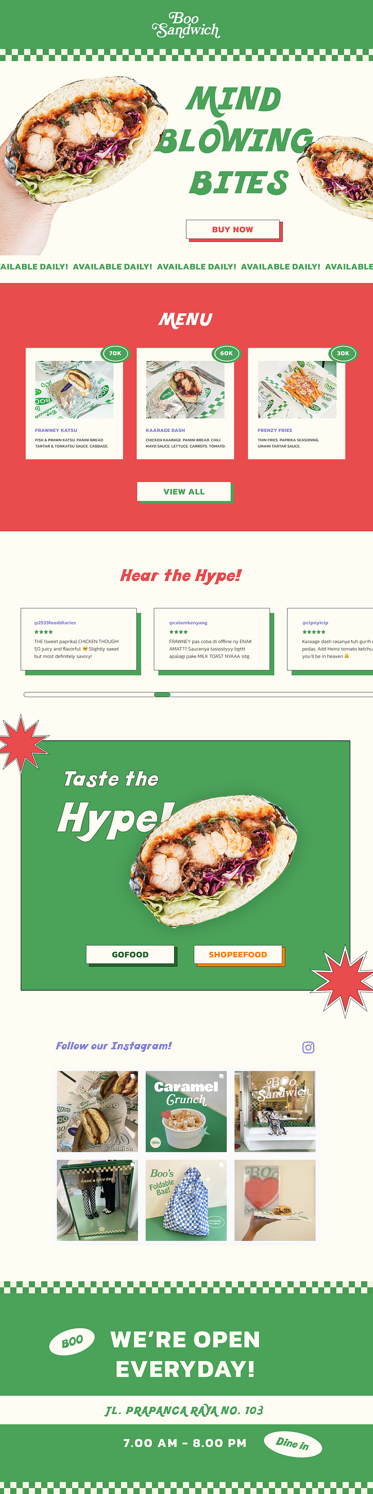
Retro Food Website - Boo Sandwich

Hi 👋🏻
Watching Relume's Design League tingled my designer senses and propelled me to make one myself 👀
I made a web design of an existing sandwich shop in Jakarta - Boo Sandwich. While I'm unofficially participating, I wanted to get that retro look by utilizing the green-creme checkered lines. Website's painted in green and red, which are Boo's primary colors, with a base of light creme for a more neutral touch. All of these edited shots are mine, except for the Instagram part which I directly screenshot-ed from Boo's Instagram ✌🏻
As a customer myself, I usually explore a restaurant's website to:
1. Check their menu
This is why I went with red as its background to quickly catch the audience's attention.
2. To make a reservation or buy the goods
Since Boo started off as a home business that requires delivery, I added the purchase button either through "GOFOOD" or "SHOPEEFOOD"
3. Reviews
I don't usually see reviews on a restaurant's page but I love reading it. It increases trust and credibility. Plus, good reviews are good for the business. It's that EXTRA PUSH to get customers to buy your products.
I personally love both the look and user experience.
Let me know what you think 😊
Let's create something together 🤝
Feel free to mail me: fionasusiantoo@gmail.com
Which one's your favorite section? Feel free to comment 😊
And don't forget to press "L" if you liked it 🤍
Thank you ✨