GFC Logo Concepts

Two rejected logos that were created during a brand update for Grace Fellowship Church.

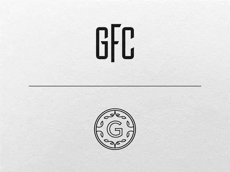
The first option is tall and bold, reminiscent of old type styles. The goal was to create a logo that feels traditional & trustworthy. You probably noticed the F extends past the other letters, this represents the importance of Fellowship.

The second option is inspired by old crests, giving it an ornate look. The natural elements are meant to convey growth. While also the leaves at the bottom represent arms outstretched, representing a joyful worshipping posture.