Olea Packaging Design #TheBriefBabes

I created branding for an olive oil company in response to a Brief Babes creative brief.
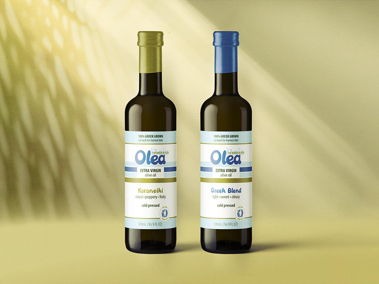
I imagined Olea as as a modern olive oil company trying to put Greece back on the map for consumers who only buy oils from California and Italy. Greece is the birthplace of olive cultivation, after all!
The color palette is a departure from the usual greens on the olive oil shelf, while still coordinating with that lovely olive-green tone on the bottle. I illustrated a little olive wreath to reference ancient Greece, keeping the bubbly style of the lettering in the illustration.
Olea logo font by Abby Leighton with illustrated details by me. Mockup from Artboard Studio.