US Treasury Spread Data

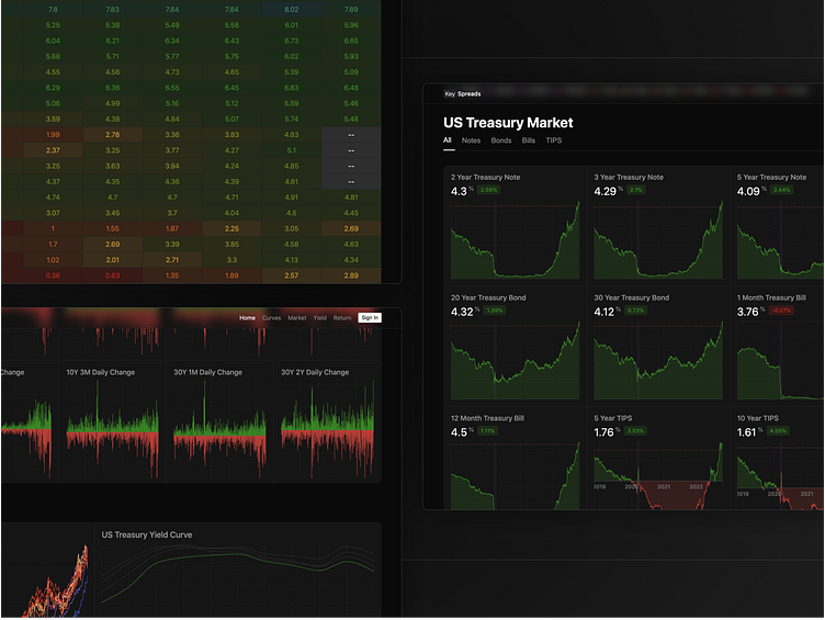
Here is the final screens for the US treasury bond dashboard I have been working on. So far it simply gives a quick overview of what the current US Treasury yields are at and what the spreads of each bond look like.
Over time I would like to expand this to include more data and tools to offer an alternative to the current expensive trading terminals that have been available for a long time.
While there might not be a market for this information outside of professional finance, I would like to a have a dashboard for myself so I can stay off news sites for this type of data. The site isn't currently updating live but it should be soon after this post goes live. You can see it at keyspreads.com
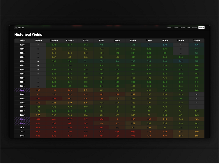
Historical Yields
Here's a gradient of what the last 30 years of treasury yields looks like. You can easily see when the era of cheap money began after 2000 and what perhaps may be the signal of it's end with the massive yield rise of 2022.
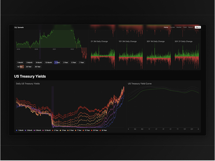
Yield Spreads
You can interact with the US treasury yield curve and change the spread between any two short and long duration bonds with the button controls at the top of the site. Beside it is a visualization of the change in yield spreads over time.
Underneath is the full spread of treasury yields plotted together to give a sense of where the steepening or flattening has occurred.
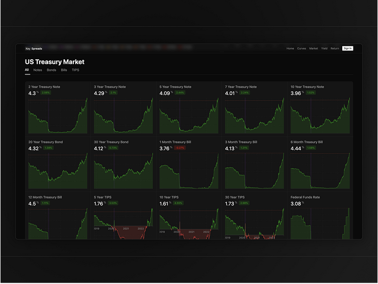
Treasury Market
Finally is the full look at the US Treasury market as well as the federal funds rate. A good way to see how news has impacted both short and long ends of the curve.