Hifumikan, a rural inn - Logo


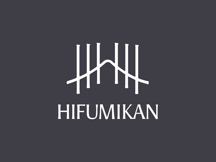
Hifumikan is a family-owned guesthouse located in rural Shiga, Japan.
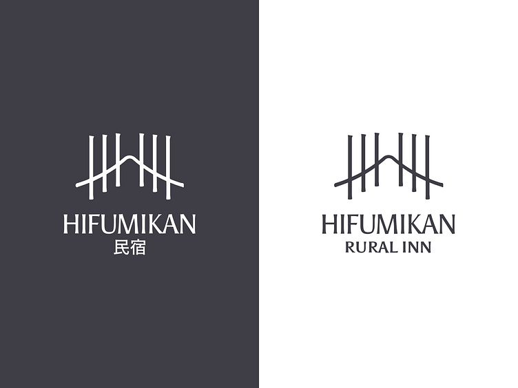
In the will to appeal to new guests, the owner wanted to revamp their website showcasing the beauty of Shiga countryside. Part of the mandate was to also design the visual identity.
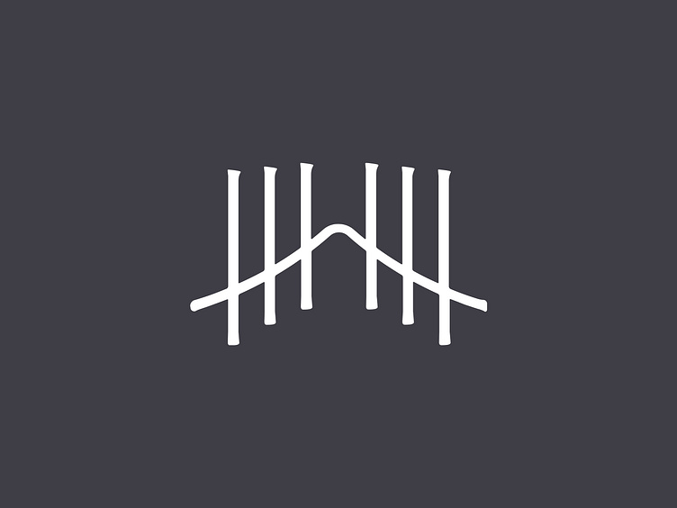
The logo encompasses with simplicity, uniqueness, and style the essence of the inn, from the H of Hifumikan, to the meaning of the name, passing by the notable landscape surrounding the guesthouse.
Scroll down to deep-dive into the creation of the symbol.

Hifumikan is written 一二三館 in Japanese. 館 here read “kan” can be translated as “house; hall; building”, in this case, the meaning implies also a guesthouse.
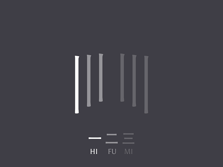
The literal translation for 一二三 would be 123, visually translated by the 6 strokes ( 1 + 2 + 3)
"Hifumi" idiom would mean going deeper (and H within an H within an H), moving forward, and counting the step.
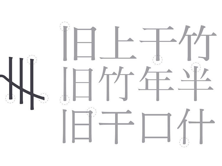
Japanese writing system has its own rules, typographically too. The logo is designed based on it. Each vertical stroke takes the details of the one that can be found in a Mincho (serif) Kanji (sinogram). Worked with more subtleties to not be too aggressive. As with a lot of Japanese characters, the logo is not perfectly symmetrical.
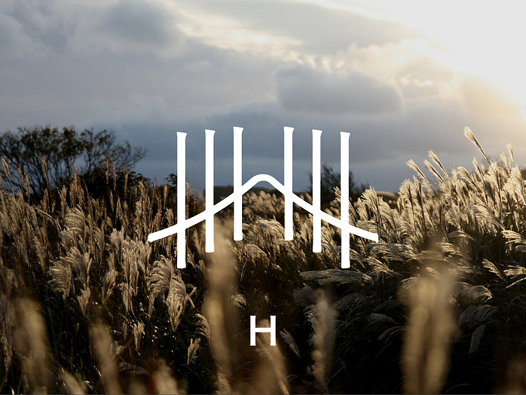
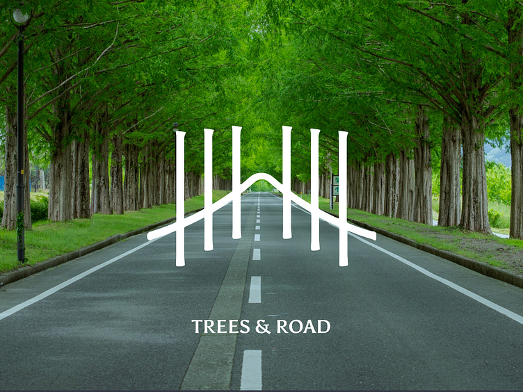
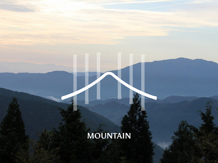
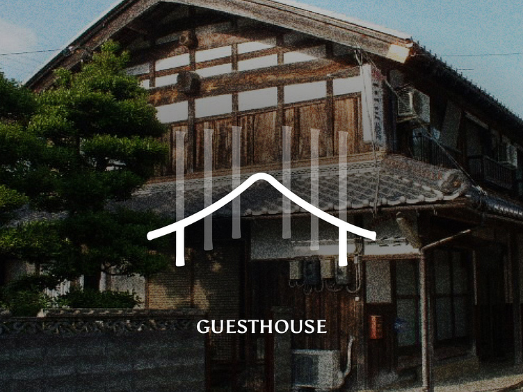
More than finding the deep meaning of the name in the logo, it is also packed with visual symbols:
the H of Hifumikan
the 2km road of metasequoia trees which is the leading landscape mark of the area where the guesthouse is located
The surrounding mountain
And the shape of a house for a glimpse of hospitality
Thank you for your time if you read until there
If you want to show some love, press L ! 😍
And you can give me feedback too 📝
------------
Available for new projects: yolainecodjovi@gmail.com
And follow me to discover more projects