KVARA™

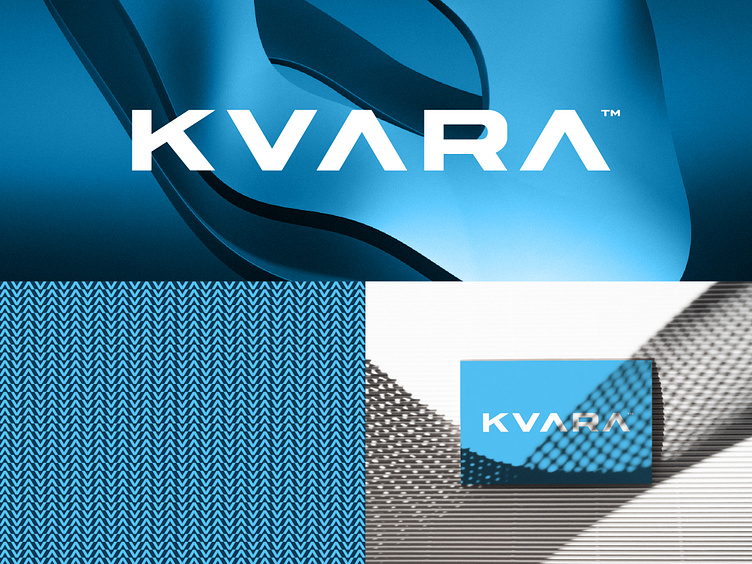
KVARA wordmark - initial concept that was not a good fit for the brand.
I like this one because the anatomy of the letters just perfectly fits together. Unfortunately, it was not a good fit for the curvy plumbing brand and symbol the client already had.
Anyways, I had to give it a spin, and show it to you guys <3
Looking to start a new design project?
Contact: info@dbworkplay.com
Thank you!