Building Rebrand

In the past six months, I have had the opportunity to work on a few branding projects but this project has to be my favourite. The building was undergoing a full refurb and required new branding.
The logo and branding style was heavily influenced by the green surroundings and the typeface was selected to stand out clearly. In a way that imitated the trees and communicated trust and reliablity for new tenants.
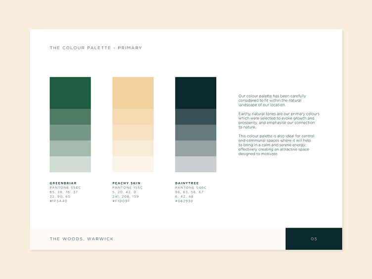
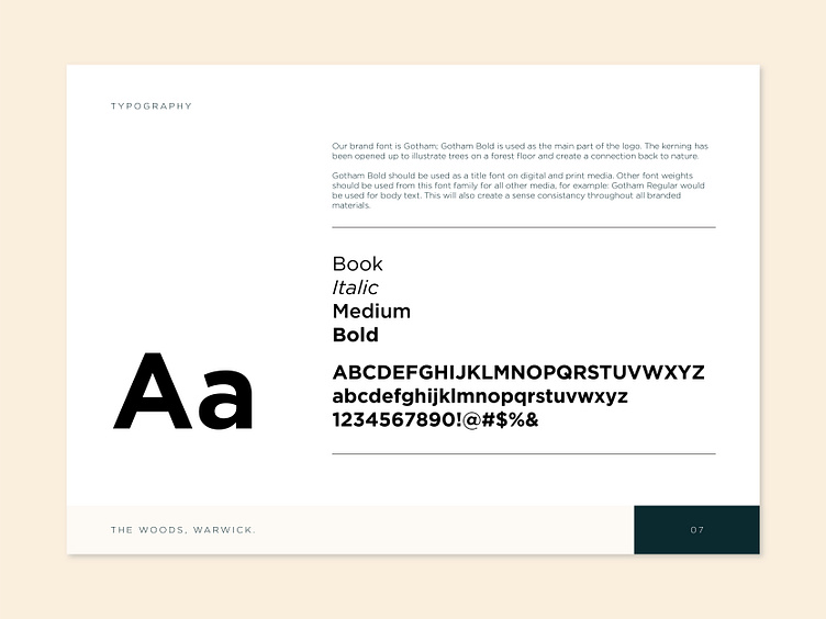

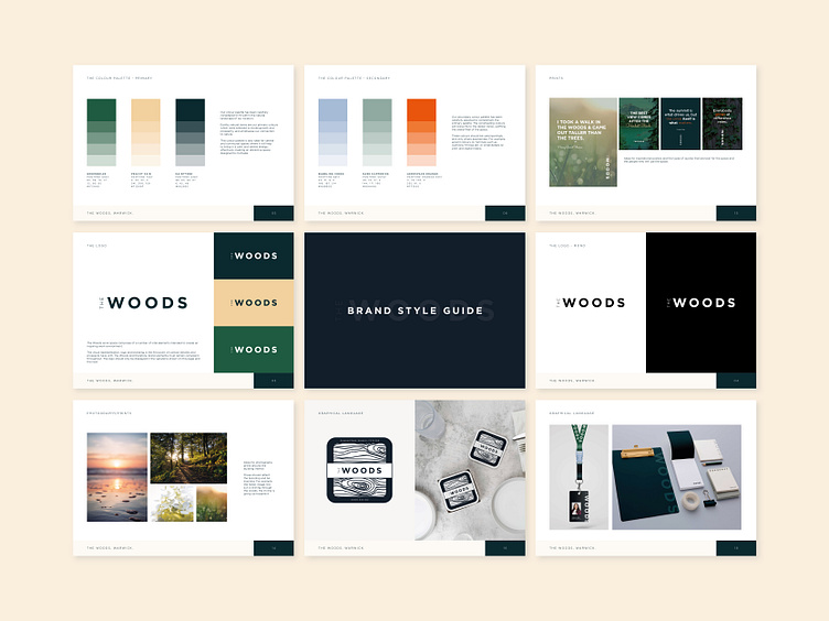
Here are some close-ups of the style guide, the pages go into more detail about the colour palette and the typography.
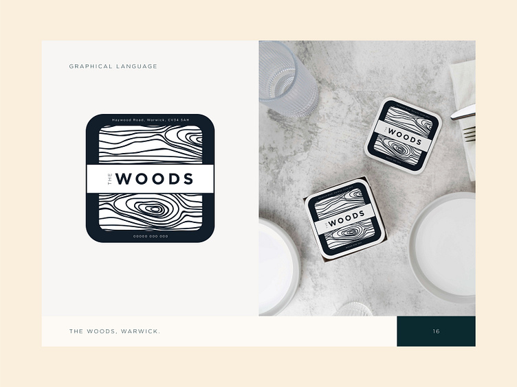
On the last two slides, I've included some branded material examples, and fun ways of drawing on the identity by using the bark of a tree and an exploded logo.
If you like this design, hit the ❤️ button! Thanks for looking!