Molecular You rebrand & site redesign

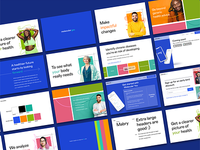
Molecular You's previous brand was a little too dystopian sci-fi. They are a biotech company that analyzes your blood profile for biomarkers to tell you precisely how to tweak your lifestyle to optimize your health. The brand told the story of the sterile, mysterious, scientific process behind the product.
When developing a brand, I like to speak to the story's end, or the value it will bring to the user's life – in this case, the user will be living a happier, healthier life full of colour, energy and vibrancy.
With that in mind, I've used these strategies in their visual design:
• Hone in on the concept of 'uniqueness' - these health insights and recommendations are speaking to what is going on in your body and your body alone as opposed to generic, catch all advice
• Photographs of a multitude of diverse faces and demographics - health is not one size fits all and the product seeks to solve that flawed approach
• Incorporation of hand-drawn lines contrasted with hard edges and lines to emphasize individuality
• A bright and multi-coloured palette to speak to vibrant and varied personal expression (and to compliment their black and turquoise app UI and logo)
• A quirky, humanist, san-serif font for warmth and approachability to neutralize the intimidation factor that might come in response to a product steeped in complex science
• Dynamic layouts and animations to breath some energy and excitement to the idea of starting your path to a better, fuller life