


Da Kine By Da C Branding

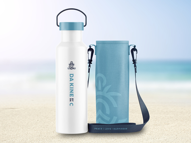
This beachy logo and branding for Da Kine By Da C features a “C” as the focal point with waves intertwined in a symmetrical way to resemble natural harmony. Palm leaves rise out of the top of the C and create the illusion of a sun to give the mark a Hawaiian flare. The top most circle and arrows emerging from the sides unify the logo and form an anchor when paired with the waves to highlight the sea ambience.
--
Need a design studio that creates cool shit? Look no further.
Drop us a line: info@8vodesigns.com