E-Commerce Website Design


Nova e-commerce is a place for new shirts, sunglass, and bulbs. We offer brand, fine quality and material-first objects, and we're proud in our effort to lead the way in offering big-scale sustainably produced goods that at its core celebrate tradition.
Challenge
As part of a new platform for the Nova eCommerce website, Nova needed to replace their Landing page, product page, and account page. Using this as an opportunity to improve a noticeably cumbersome experience.
Project Goal
1. Design of the Landing page to accommodate more part and material configurations
2. A more helpful tool to assist in-store staff with sales
3. Design of the Landing page to accommodate more part and material configurations
Workflow & Research
I do some deep research and find some key points.
1. Users often find that eCommerce websites are difficult to understand.
2. It is a burden for them to switch between several websites for finding the best products.
3. Users wish to have a simple sign-up process.
4. Users want simple products page with true information.
Sketches & Wireframe
I had tried 15+ iterations of sketches and find a perfect layout that help the users.
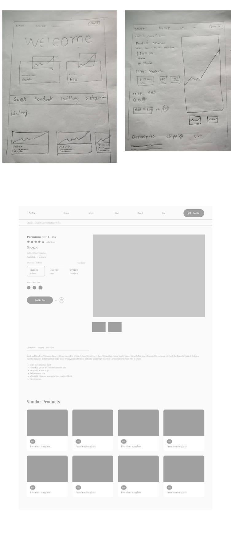
The Landing Page
Regarding the Landing page here I decided to go with the ‘Welcome” text which gives users a warm welcome. Welcome messages for websites are a great way to convey the core messaging of your brand by using welcome messages that showcase powerful features. Along with that, there will be main feature product cards and social proof list.

The Final Outcome
The laws of UXUI played an important part in my designs, starting from the first sketches created for the Crazy 8’s stage of the process. Throughout the design process, I was careful to keep accessibility guidelines in mind, as accessibility shouldn’t be an afterthought in design. In terms of the colors used throughout the designs, it was straightforward in ensuring that there was a high enough contrast between colors so that they were accessible to users with visual impairments, due to the palette being black and white, with shades of grey in between. If I had more time or the ability to launch this project and collect user feedback to support my hypothesis, I would like to use A/B Testing and Data/Web analytics, as seeing the user’s journey, where users fell off, and how much converted are great ways of realizing and confirming what pain points may exist and are causing a problem for users.

Thank You
Feel free to hire me to have a free consultancy chat. I would love to help you with your brand launch, redesign, or UX strategies.