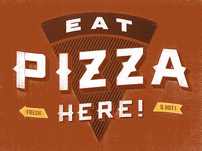
Eat (even more) Pizza Here!


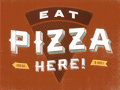
I tried on a more subtle dimension to the type… I'm digging the monochromatic feel. I think it's easier on the eyes and a quicker read. And in a way, it almost feels more "vintage" now.
I tried on a more subtle dimension to the type… I'm digging the monochromatic feel. I think it's easier on the eyes and a quicker read. And in a way, it almost feels more "vintage" now.