DailyUI 016 - Popup/Overlay

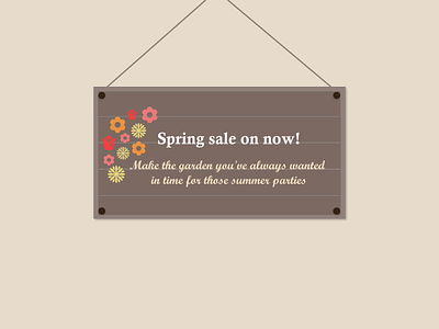
So this idea came about after looking at the colour scheme I was given and there was quite a bit of brown and I had recently drawn a sign similar to this design on a whiteboard. Since popup's and overlays are on top of content, I thought the concept of a sign could be done as well.
Now I know it might not be as easy to implement if the user has to scroll down but I think it's a pretty cool concept that it looks like a sign is hanging in front of a website. I was imagining that this sign would be for a gardening website since it has that look about it.
The curly typography is also a bit of a risk since this can be more difficult to read. However, I thought it might be alright since that is just the secondary text, the main thing the website would want customers to read was the fact that there is a sale on.