BIKEMARKET.CO.ZA

An identity created for the leading second-hand bicycle company in South Africa - Bikemarket.co.za.
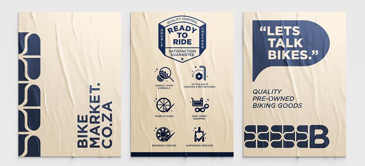
The logotype was inspired by the curve of welding joints on a bicycle frame.
The frame is a very essential part of these beautiful inventions.
The shape within the "B" translates into a "trademark" pattern that bicycle tires make. It is used across different platforms for branding purposes.