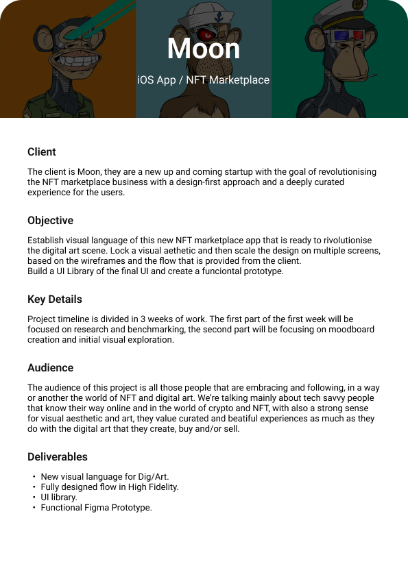
NFT Marketplace for Moon

Introduction
I’m kickstarting my design career with Dribbble’s Intro to UI course. With little previous experience, this was a step in the right direction. I was able to learn the essential foundations of UI. This is my first case study project I was able to understand the process of creating an interactive application.
Challenge
The client is Moon, they are a new up-and-coming startup with the goal of revolutionizing the NFT marketplace business with a design-first approach and a deeply curated experience for the users.
Establish the visual language of this new NFT marketplace app that is ready to revolutionize the digital art scene. Lock a visual aesthetic and then scale the design on multiple screens, based on the wireframes and the flow that is provided by the client. Build a UI Library of the final UI and create a functional prototype.
Mood Board
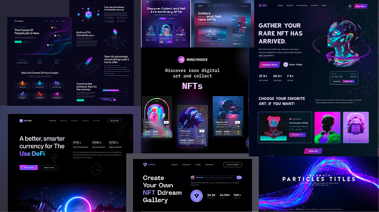
I started the process by researching existing NFT marketplaces. Then creating a collection of images for two different mood boards. The first one is dark with neon-colored accents and gradients, the second example is lighter colored with a variety of colorful features.

Wireframes
They provided us with five wireframes a splash screen, home, search, profile, and NFT page. With a foundation set, it was easier to make the design. When I started designing with these wireframes, I altered a couple of features to better suit the visuals, like the navigation menu.

Visual Exploration
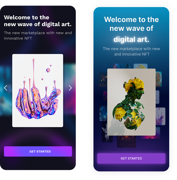
After exploring a variety of UI visuals, I decided to go with a dark theme which was most of what I saw in my research. I felt this was the visual aesthetic that fits best. I also kept in mind that the main audience is tech-savvy people who know their way around the world of crypto and NFTs. These are two of my first rough designs.
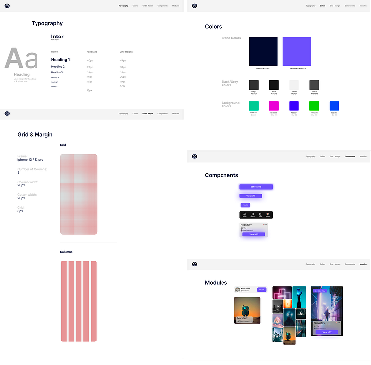
Design System
During this step in the process, I put my attention closer to the details. While creating the style guide, I made several iterations to the design to make it flow better. Instead of a gradient background, I switched to a simple dark and had only one other primary color. I also changed the photos to better compliment the theme.
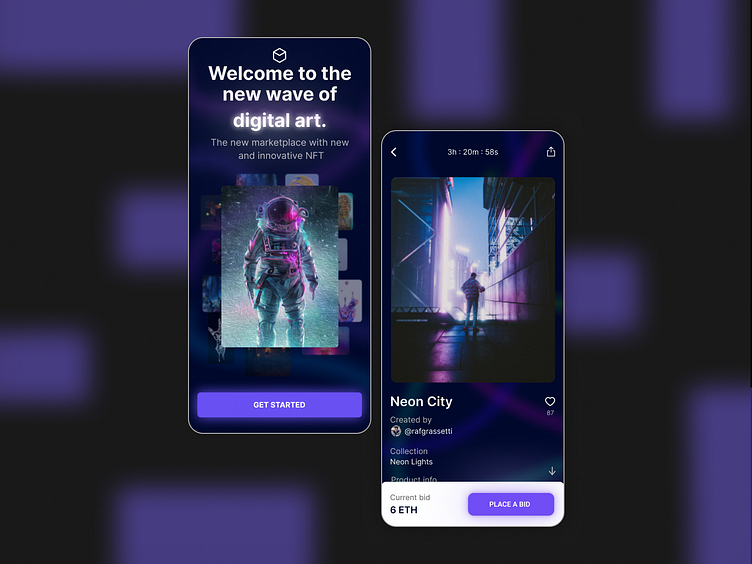
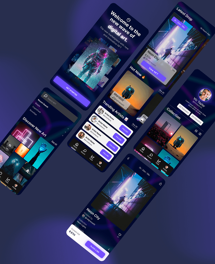
Final Screens
Summary
Looking back on the development of this case study, I learned a great deal about the process and enjoyed it too. Most important was doing the research, knowing what the end product is supposed to be, and always looking back on the objective to stay on track. Going forward, I'll keep these things in mind and keep improving.
Find me on LinkedIn