Designlab UX Academy Foundations | Type for a user interface

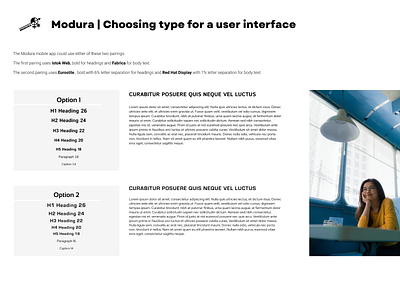
As part of the Modura project, I was asked to create a logo, do a competitor analysis and build colour style sets. Now it was time for choosing some fonts for Modura’s mobile app, so it was important that the fonts I chose were suitable for a mobile user interface. For this project, I put together two different font pairing options for the headings and the body text, considering readability and usability above all else. I began by browsing the Google Fonts library, specifically fonts that belonged to the Sans Serif family. I identified two pairs which could go together and added them to my Figma file using what I thought would be an adequate weight for each heading and body text. It wasn't until I used them in an actual copy (lorem ipsum is fine) sample, that I could truly see the pairing in action. After a few changes of heart, I determined the above could be a good fit. What do you think?
See my portfolio | Follow me on Instagram ⦁ Pinterest ⦁ LinkedIn