Burano's Ristorante Italiano Branding Package

‘Fishermen from the island of Burano first started painting their houses in vibrant colours to see them in fog or from a long distance when they return from sea. However... many local guides say that houses were painted colourfully so that drunk sailors would recognise their houses as they came home after a long night of drinking’
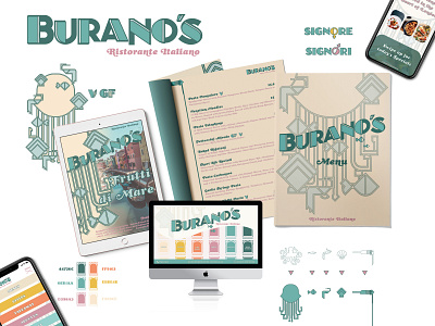
In the design we wanted to reference this funny anecdote - therefore our logo is a little “off” in places: the line weight and the kerning is slightly different with every letter, and the characters’ heights do not align perfectly either. It is almost like you are looking at it after drinking a bit too much…
As for the rest of the brand collateral, we have referenced art deco style, mixed with sealife imagery - excluding the usual Italian restaurant design clichés - such as the colours of the Italian flag or glorified images of tomatoes & pasta. Instead, we created a visual language that is both elegant, something new, but also references elements people are familiar with.