Tiara | Wordmark design

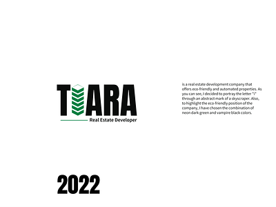
Tiara is a real estate development company that offers eco-friendly and automated properties. As you can see, I decided to portray the letter "i" through an abstract mark of a skyscraper. Also, to highlight the eco-friendly position of the company, I have chosen the combination of neon dark green and vampire black colors.
Drop your opinion in the comments section.
_____
For brand design inquiries:
T: +380930792808