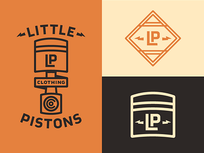
Little Pistons Logo Concepts (cont'd)

Reusing the piston head for the secondary logo better compliments the primary logo than the diamond, but I wasn't settled on how it looks from my last shot. Either removing the lightning entirely or repositioning one with the initials has a better sense of balance, so that's where I'm at now. Trying out this whole “iterate in public” thing.
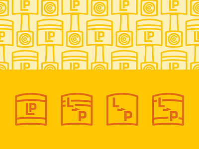
I'm also fiddling around with an expanded color palette and a pattern.