Friday Floats Branding 🌴 🌈 🏖️


🌴 A branding, that sends summer vibes through the screen 🖥️
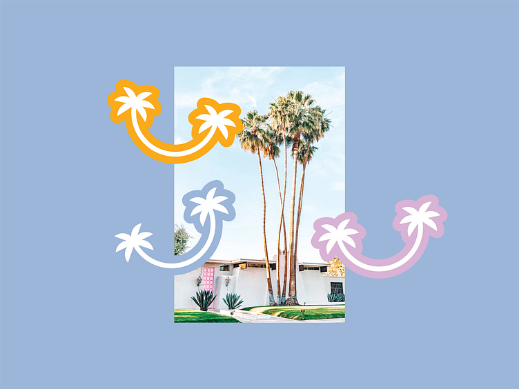
Creating a brand that is connected to the summer holidays ☀️ needs an understanding of the colour meanings and associations 🌈. Here are the summer-associated colours that we used for the branding and their meanings in psychology: 💁🏻♂️
- 🟢 Shades of green are associated with harmony, tranquility, and health 🌿
- 🟠 The orange colour means happiness, excitement, warmth, change, and energy⚡.
- 🔵 Blue is usually connected to cold, calmness, and wisdom 👴🏻.
- 🟣 The violet color, as a shade between pink and purple, combines meanings from both of the colours. Psychologically speaking, violet has romantic, exotic, and wealth energy💱.
- ⚪ White is the colour of purity, innocence, and a sense of space 🌌.
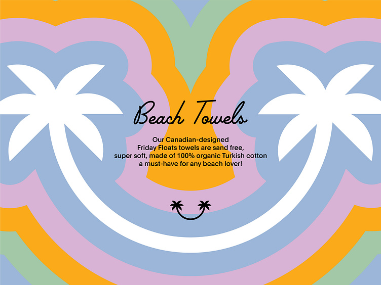
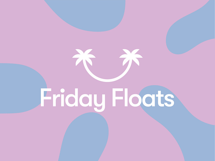
We have also included an association with the summer in the logo element 🌴. It represents happiness and holidays at the beach 🏖️ at the same time.