icoffee case study
icoffee Branding
icoffee gives access to local coffee shops where you can place your coffee orders, collect stamps, redeem rewards and send gifts to your friends and families, as well as, building communities where you can engage and share with each others, baristas and managers!.
Making everyday coffee much more accessible and easier to people!
icoffee is more than just a drink. It's a bond. It's a community. And it's happiness!
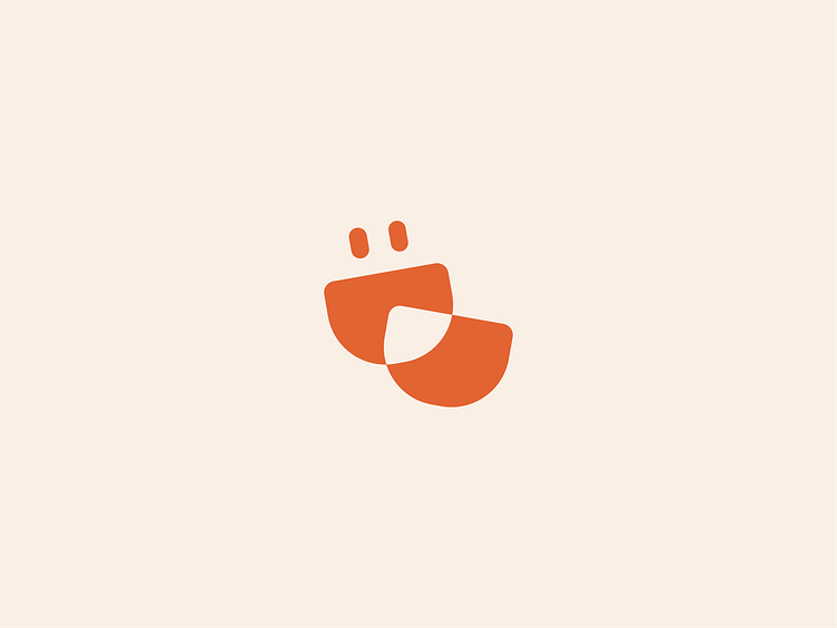
That is why the logo is 2 cups of coffee intersected, representing bond and community, plus a happy face because drinking coffee makes us happy!
The vibrant color palette and joyful typeface combined, give the brand a lively and dynamic feel, yet with credibility.
Get in touch with me:
srezzat88@gmail.com — www.srezzatdesigns.com — Instagram — Behance
bonding
brand
branding
coffee
community
concept
connection
cups
design
easycup
happy
identity
joy
logo
logomark
minimal
simple
smart
tech
ui
View all tags
Posted on
Sep 13, 2022
More by Sara Ezzat View profile
Like


