Rascal Case Study

Overview
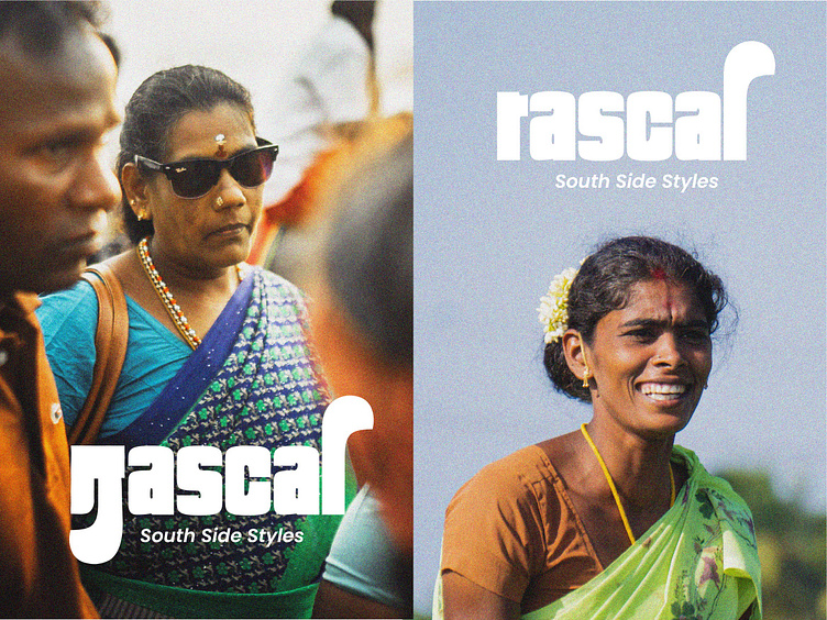
Rascal is a loud, bright and bold South Indian street style clothing store aiming to empower the local textile community while catering to the ever-evolving fashion needs of the youth.
Brand Identity & Packaging
Moodboard
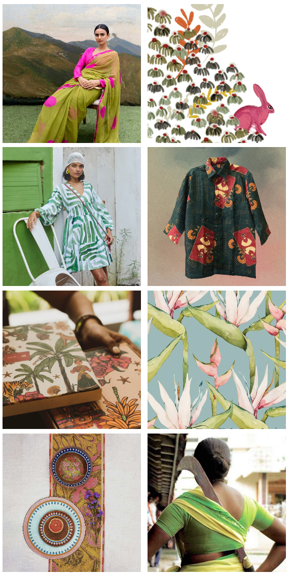
In the thought of building a bright and bold brand, I wanted the moodboard to depict the same. The primary goal was to create a brand that is a potent blend of southern culture with a western influence. I have taken the Aruval as a big inspiration for this brand as it can be represented as a weapon and a tool.
Logo Process
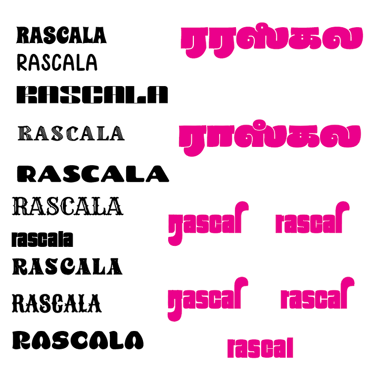
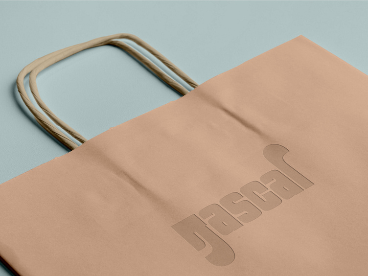
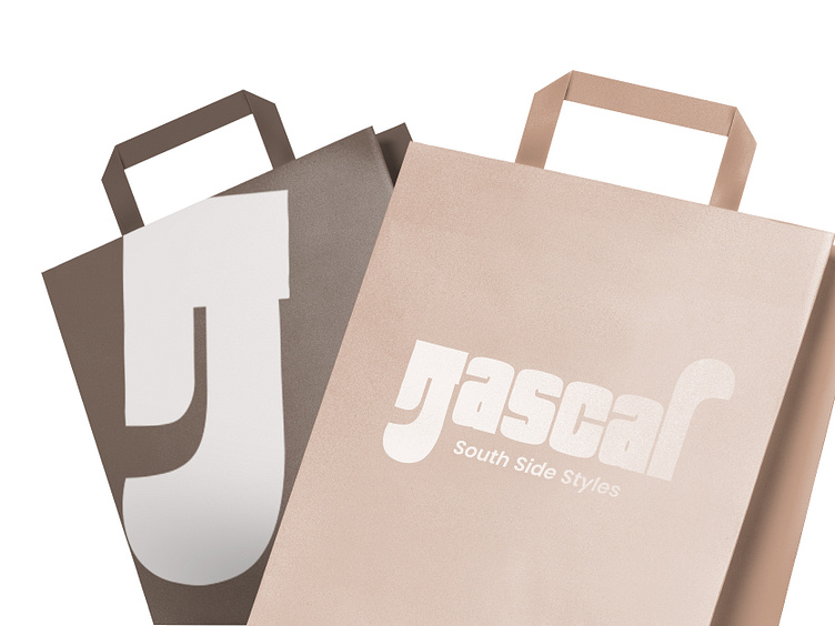
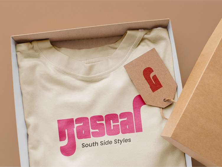
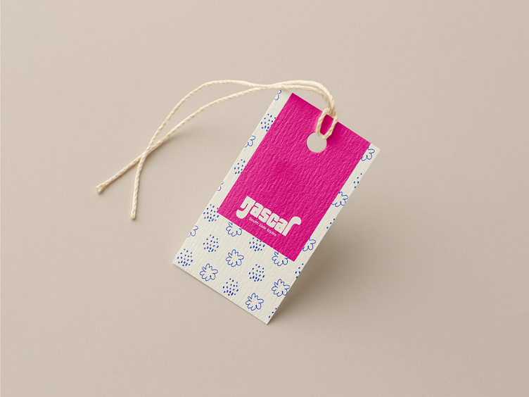
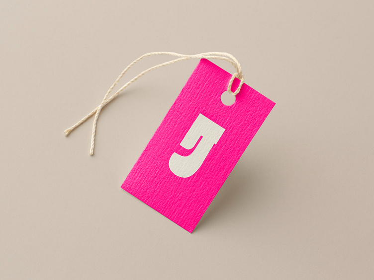
The logotype of Rascal is a combination of both Tamil and English font types. The Tamil "ra" is customized to the shape of the Aruval. To bring balance to the logo, the last letter "l" is also typographically manipulated in the form of the Aruval.
The image below shows some of the logo processes that did not make the cut and the development behind the logo.
Final Outcome
Logo

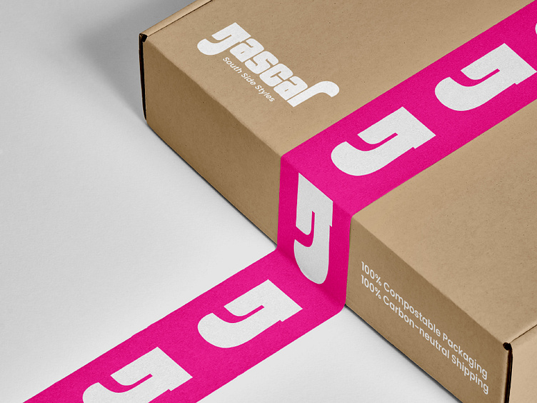
Packaging
Clothing
Learning Outcome
Working with fonts other than English was a little tricky but combining them brings a unique twist to the logo. Some important lessons I learnt:
It is crucial to maintain the visual balance throughout the logo when working with different languages.
Fact-checking is essential when working with cultural elements in the brand identity.