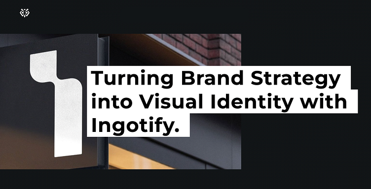
Brand Identity development for Ingotify

About:
Easy Exhibit is a global trade show campaign management agency helping international exhibitors with streamlining their operations while maintaining their brand consistency.
2020 was the 10th anniversary of the company, with Covid-19 shutting down almost every event worldwide since March 2020, the company pivoted toward a higher added value service that would be relevant even when tradeshows are at a halt, so they created Ingotify as a spin-off brand from in September 2020 to focus exclusively on brand strategy for industrial manufacturers in the region.
This was work done in Sep 2020 based on an initial positioning, now the company has shifted its focus to a different strategy. In this case study, we illustrate how we went through the process back then and what we designed according to our discovery.


The Strategy Phase:
The Ingotify team decided that they have sufficient evidence to expand with a new brand and launch Ingotify as their sister company, focusing mainly on strategy development.
The problem they were facing was that when their clients visit their website, their first impression is that Easy Exhibit is just a manufacturing company for the exhibition stands on trade shows. We had to show that they do much more than that and that there are important steps before the actual stand execution - discovery, strategy & design.
We were invited as a strategic & creative partner to review their strategy and execute their new visual identity according to all the insights they have rendered from the discovery workshops.
Let’s have a glimpse at a small part of their strategy, positioning & brand character:
Brand Name:
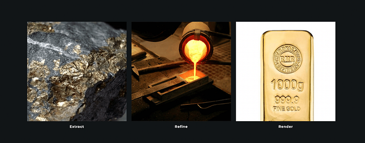
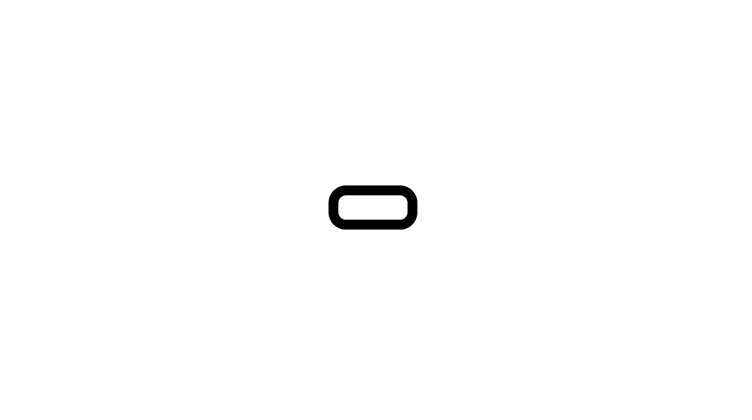
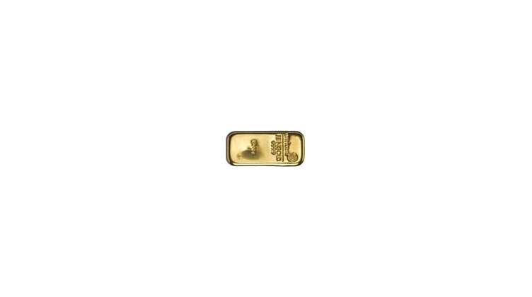
Ingot - Definition: a block of steel, gold, silver, or other metal, typically oblong in shape.
-fy. a verbal occurring in loanwords from Latin, with the meanings “to make, cause to be, render” (clarify; purify); “to become, be made” (liquefy)
“The idea is that we believe there is gold within each company's people, products, services. Just like gold, it needs to be detected, extracted raw, processed, refined, and polished before being minted into bullion, or ingot. We don't know what metal we will find bronze, silver, gold, platinum, but our process is a consistent rendering of whatever precious is in there into something valuable, and that clearly communicates its value.”
The Stylescape Phase:
After the Strategy audit we did together we outlined interesting insights and important steps for action when we get into the visual part of the brand development. The best way to illustrate what exactly will be our creative approach is to jump to the next phase of the project, which is developing the Stylescapes.
This phase helps us set the ground and be on the same page with our partners in terms of what directions we offer and which one exactly is the right one to take on, also according to their needs and goals.
This phase is really crucial to every creative project and helps with minimizing the risk of future revisions and scope creep.
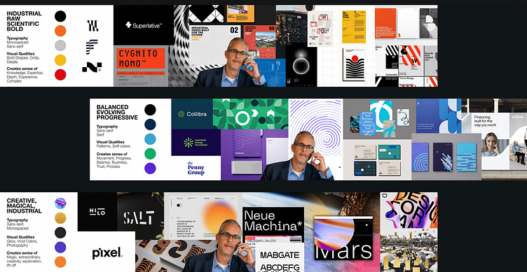
The goal:
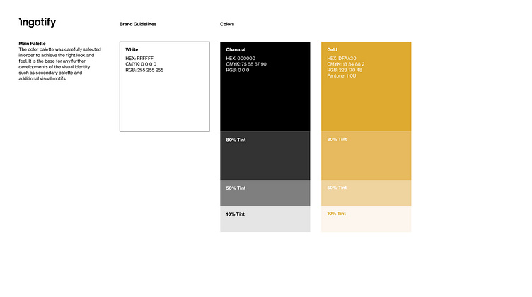
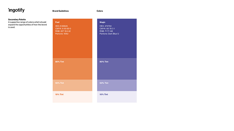
Our goal of course was to create a modern, simple yet specific look and feel that resonates with the outlined brand strategy, goals, and target groups we have on the table.
Some keywords we looked at to develop the identity are: Gold, oblong, render, transform, progress, liminal, transition, industrial
Scroll below to see the chosen logo and the idea behind it, along with parts of the brand identity guidelines that we worked on.
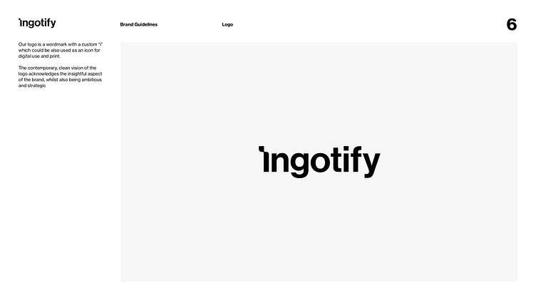
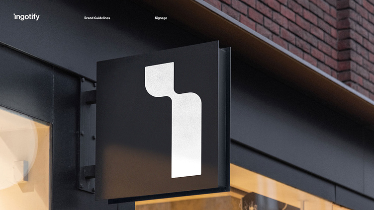
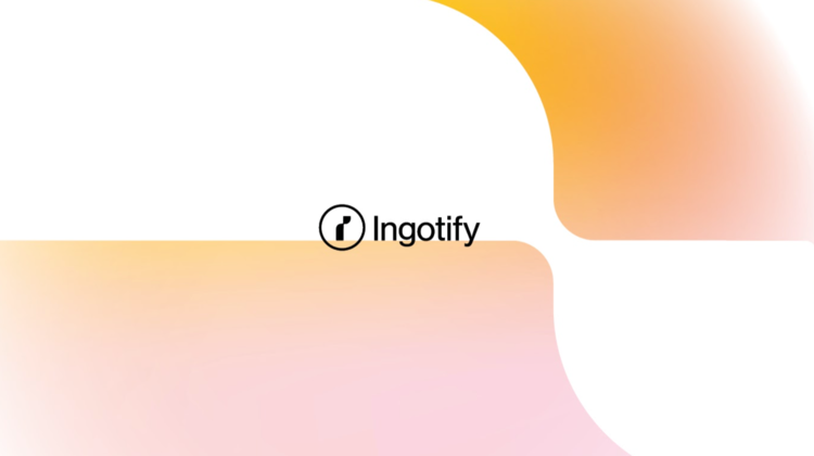
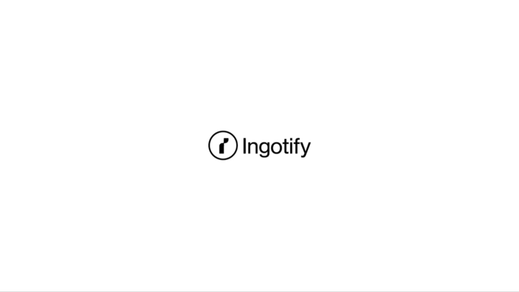
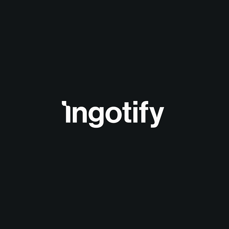
The chosen logo:
The final chosen logo is inspired by the designs and direction in Stylescape #3 and it is a wordmark with a symbol option.
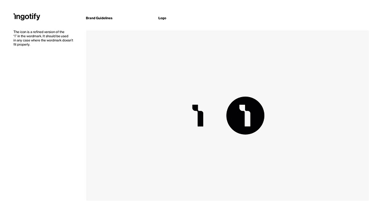
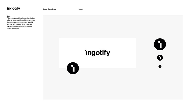
It aims to show transformation, progress and it sticks to the idea of finding, rendering, and extracting the gold, shown more specifically through the first letter “I“.
We wanted to express also the liminal moment in a process that makes you shift from one direction to another. The logo is simple and memorable and it gives a lot of freedom in terms of further development of the brand.

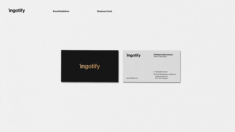
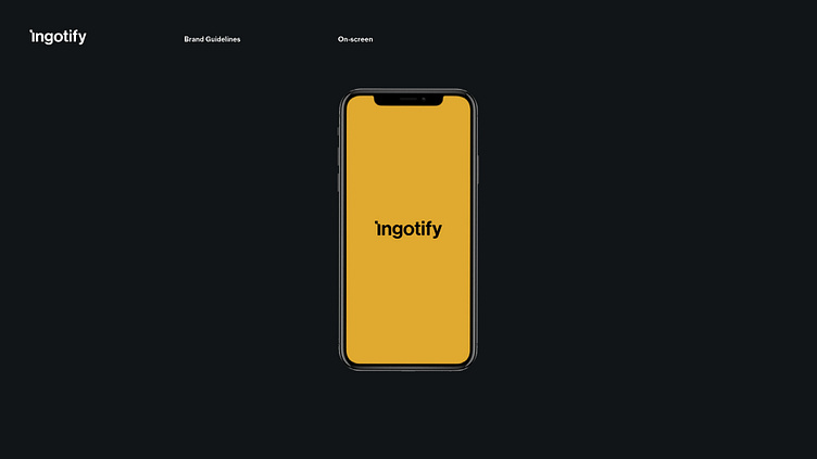
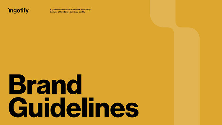
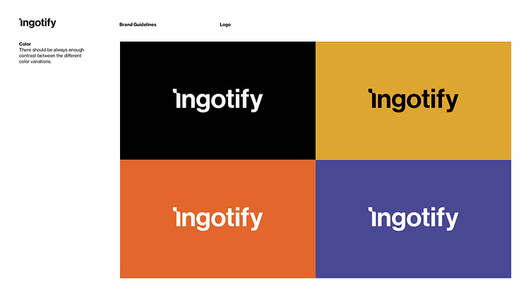
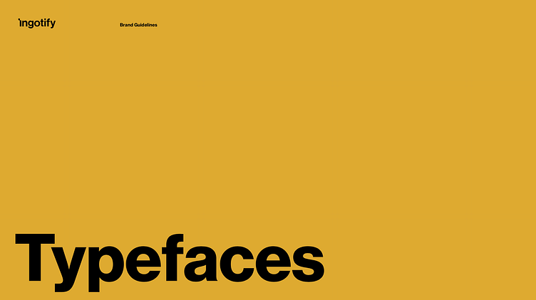
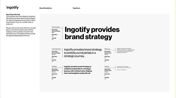
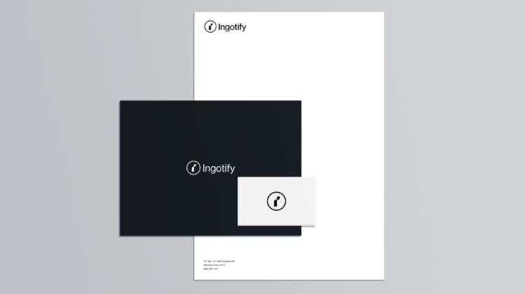
Developing the guidelines:
After we set the ground with the chosen logo and some application examples it’s time to build the visual ground rules of the visual usage of the brand that captures and communicates its character.
This is a crucial part of every brand identity and it’s the bare minimum every company should have in order to make sure there is some consistency on every touchpoint with their customers.
Other logo options that we presented:
Direction 01:
Direction 02:
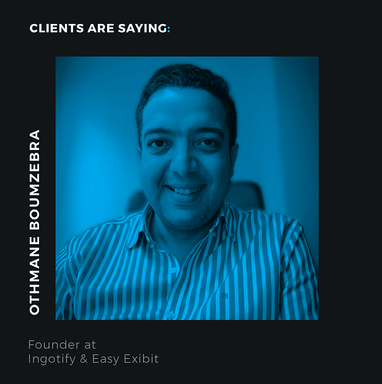
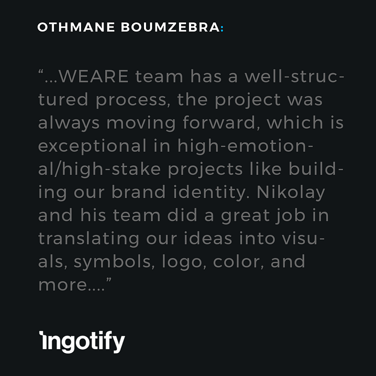
Client Testimonial:
Project info & credits:
Period:
Jan-Mar 2021
Services:
Brand Strategy Audit
Brand Identity Design
Brand Guidelines Development
Art Direction
Stationery Design
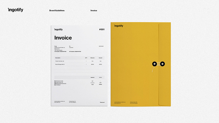
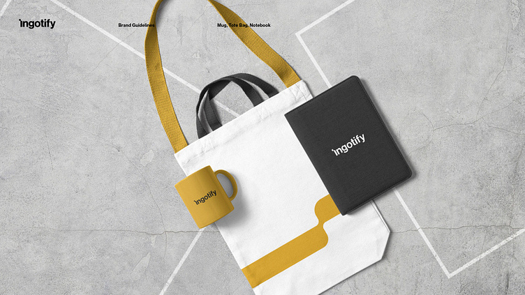
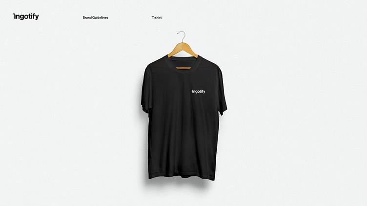
Deliverables:
Brand Identity Design
Brand Guidelines Development
Stationery Materials Design
Credits:
Client - Ingotify / EasyExibit
Tsvetan Mitev - Brand Strategy + Identity Designer
Nikolay Petkov - Brand Strategy + Project Management
Othmane Boumzebra - Brand Strategy Development
Interested in working with us?
Thanks for watching!
__________________________________