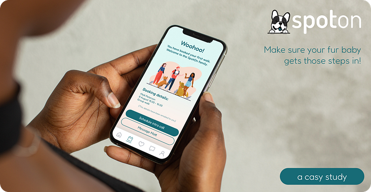
Spot On - a dog walking app
This project stretched from concept and strategy, to prototyping and user testing, and the journey between the two.
Analysis of the market & existing competitors
Although a more readily available product in many areas of the US, there appeared to be no existing option in South Africa. Market research indicated that such a product is widely needed, but trust and security were the greatest concerns. Having no local competitor, it was necessary to analyse international competitors to garner insights and a potential USP.
Other players in the market
While many offer very similar services, the standout features were:
The ability to track walks live on the app
Rating & vetting of walkers
Additional needs or 'care' options that walkers may offer
A report back or 'diary' of the dog's experience
Below is a summarised look at three major players in the global market:
User Interviews
User research confirmed a need in the market, albeit with reservations and precautions. Pet sitting seemed a lot more common, than arranging a walking-only booking. No one interviewed had an easy or simple method to arrange such a service, and relied primarily on whatsapp conversations (with plenty of back and forth).
The two stand out requirements were:
Service providers who care deeply about animals and would treat the dogs well
Assurance that the service providers were trustworthy & good communicators
User Persona
Based on the information gleaned in the user interviews and understanding of the wider market, a few user personas were drawn up to encapsulate the target customer, their behaviours, needs, and preferences.
For this initial phase, it was important to first focus on the needs of the dog owners, as they are the ultimate client (without whom the product would not be required).
This process shone a light on the clear fact that:
As long as each dog is well cared for,
dog owners are happy and their needs are met
User flows
Empathetic user flows are evident in our daily apps, where little thought is required by the user as to what to do - when & how. The flow allows users to move smoothly through the journey, without frustration or confusion.
The aim with the user flow of this sign up and onboarding process was to ensure it followed the most logical and natural path, while extracting the key pieces of information as early as possible to allow for targeted marketing and follow ups in the case of an 'abandoned cart/booking'.
Wireframing
This process was the most challenging at first, as it can be so tempting to dive immediately into the visual design of an application. The wireframing process allowed for the key elements to be included without any distraction or clouding of details.
The wireframes were dictated primarily by the user research - attempting to answer each question or step as the user requires it. There were a number of versions of the wireframes - testing each with one or two potential users for feedback and tweaking accordingly.
The Visual Appeal
Bringing colour and a cohesive feeling to the frames and ideas saw the app come to life. To begin, a moodboard guided the colour, font, and 'mood' choices. The colours were selected for their representation of both fun, safety, and relevance.
The initial design of the screens was a tricky process and for a while, I was torn between two 'looks'. After much discussion, and many stale mates, the final user persona crafted determined the look and feel most appropriate.
The design that did not make it:
And the design that did:
These soft (somewhat ice-cream inspired) colours allowed for greater contrast for legibility and a softer, less intimidated feel. The teal inspires feelings of stability and confidence, with the warmer hues imply feelings of home and comfort.
Developing the design for scale
With this initial look in place (coupled with the wireframes), there was enough information known to develop a component library of elements that would then be available for re-use throughout the system.
The visual design expanded from there, to further onboarding and booking screens to complete the journey from initial sign up to booking confirmation.
Bringing it to life with Prototyping
With the static screens complete, the last element before the true experience could be felt was to prototype the process from first opening to booking a walk. The wonders of Figma prototyping allowed the process to be experienced, interactive user testing to take place, and the required tweaks to be made.
So what now?
I found this project an incredibly worthwhile experience - to follow the full product design journey from ideation to prototyping a completed design. I took away many learnings to apply to future designs - specifically the value of wireframing and user personas to help guide and inform every product design decision.


