


Big Stretch | Dog Walking App

The Challenge
As a student of Dribble’s Product Design Course, I was tasked with designing a pet care app, which included market research, interviewing dog owners, creating personas, user frames, and wireframes, applying visual design components to two user flows, and finally, prototyping and testing.
We kicked off this project by brainstorming potential user pain points as a team. Based on this, my market research analysis and interviews, I identified three problems that this app design would solve for pet owners.
1. Building trust between caretakers and pet owners.
2. Providing custom care for dogs with special needs.
3. Giving their dog the best quality of life.
Research
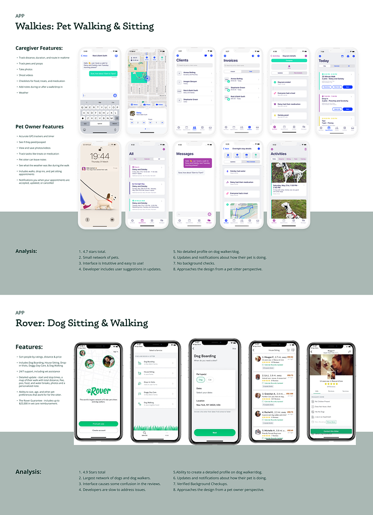
I reviewed popular pet care apps to identify must-have features and missed opportunities. Based on my review of apps like Walkies, Rover, and Wag!, I found that more needed to be done to build trust among users.
Interviews & Personas
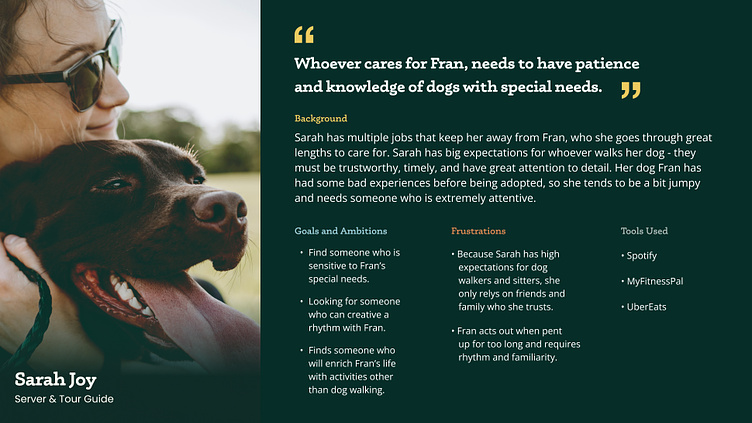
After crafting 10 curious and open-ended questions, I interviewed five different pet owners on what their needs were when it came to their pet. I avoided asking them pointed questions about features found on pet care apps until the very end of the interview. I found it very interesting that most of the folks I interviewed were worried that their dog did not qualify for care based on the fact that they might be aggressive, socially anxious, older, and/or needing extra care.
Based on this assessment, I decided to focus the user experience on folks who have dogs that require special care.
User Flow
I wanted to put myself in the shoes of someone who might be onboarding the Big Stretch app for the first time. What information is necessary for them to find the best pet caretakers? Once they've set up a profile, what would be the easiest way for them to book a service and pay? I wanted the user flow to feel as simple as possible with little room for error to checkout.

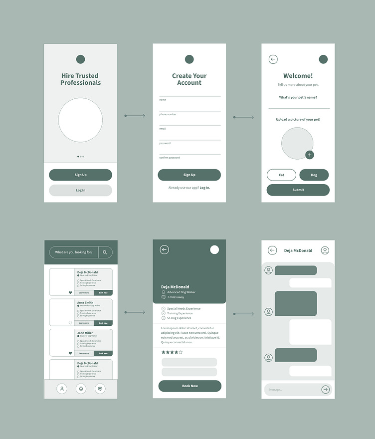
Wireframes
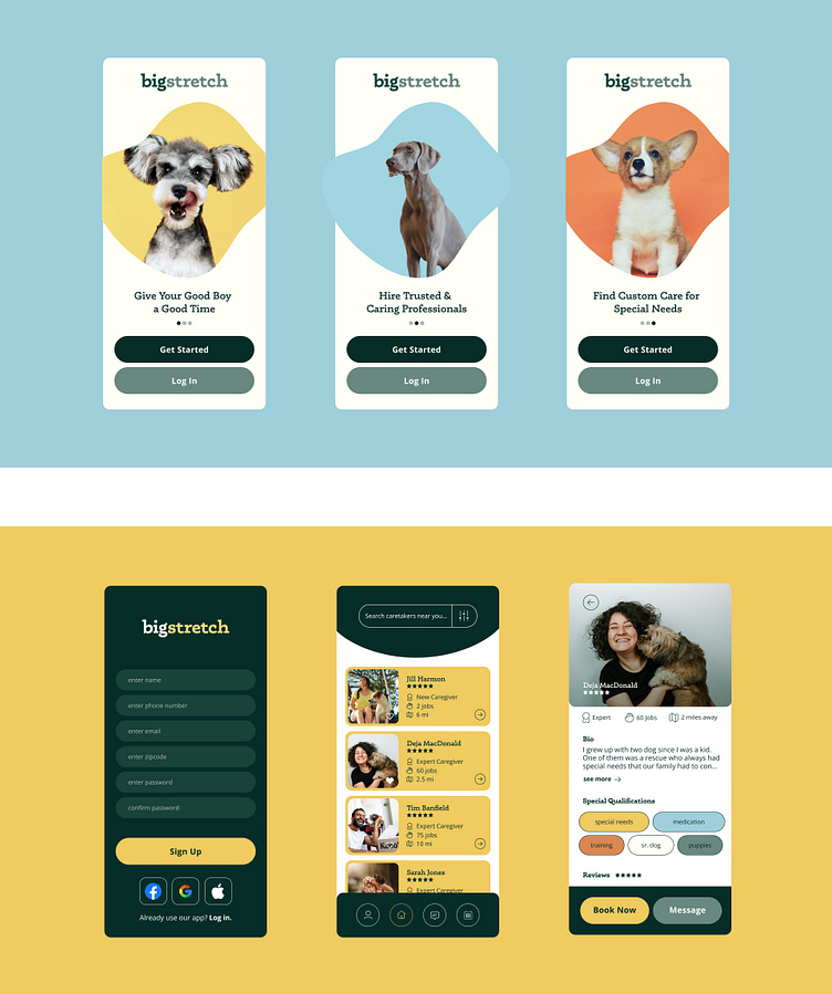
I prioritized clear communication of the app's goals and values in the first set of wireframes to build trust and garner interest with the user. Once the user moves on to make a profile on Big Stretch, I wanted the act of making an account to be fun and engaging, and not feel monotonous. I did this by creating different ways of engaging with the profile setup outside of just typing into input fields.
In the booking wireframing flow, I created smaller version of a more detailed profile so that users to scan and filter for caretakers that were the best fit. These wireframes evolved a lot over time once I worked with the prototypes and tested the usability of the app.
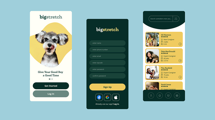
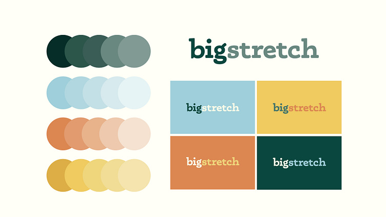
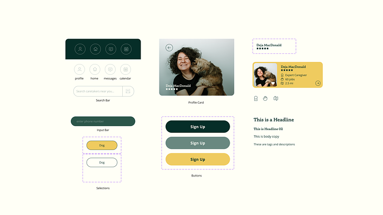
Visual Design & Components
Now, for the fun part. Since trust building and enhancing quality of life are two goals of the app, I wanted the branding to feel trustworthy, accessible, and bright and energetic. I think that the brand achieves this through a friendly serif and a combination of sunny and earthy tones! The dark green is a nice replacement for black and provides a lot of contrast with white text.
Final Thoughts
The final design aims to provide an experience that feels simple and easy to use, but provides all the details that a pet owner might need in order to feel that their pet truly is in good hands. For those who might need special services for their rescue, foster, or disabled doggo, the qualifications of each caretaker is easy to identify and filter.
While I've had experience in the digital space, getting into the nitty gritty of figma was probably a highlight of this project for me. User research provided a lot of fuel for problem solving and made the whole project far more personal. This project is a work in progress, but it was fun laying the foundation for something that might make someone's dog a lot happier!
Thanks for reading and watching!