Time Container Branding Pt 24

CB Design Production: Time Container Branding Pt 24
Full project can be found on our Behance
In the name of "time", a campaign was launched for the city of Shenzhen: “Reshape the imagination of time", we invite all "time friends" to "spend time" together and create a "time container".
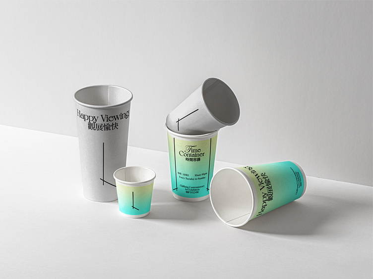
“Time” and “Container” are implemented as key visual elements. We extract our design concept from “Time Lapse”. The exhibition opening time 16:00 (displayed as analog clock hands) is used as a highly recognizable visual, when horizontally flipped, it becomes the exhibition finishing time 20:00. The symmetrical eye catching symbol was created to easily communicate cross different media channels.
Considering the structure of analog clock hands, we respectively set exhibition opening and finishing time as cyan and yellow to display time even without numbers. When the two color blend together, we have a nice gradient color palette to express the spirit of Time Container in an abstract way.
We certainly hope you like it. Thank you.