Round Yosemite Icons

I made these as a small weekend project and think they turned out pretty well. I've been using them myself and they go great with the system icons in Yosemite.
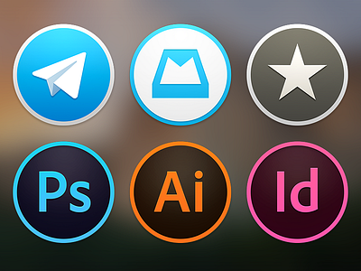
The 3 Adobe icons have the same style of transparency found in the original square ones, but with the added depth and emboss styles inherited from the system icons. All 6 sport very carefully-conceived shadows and gradients, plus the same proportions, grid, and outer-edge styling as the ones from Apple. This means they will be perfectly aligned in the Dock, and look natural next to iTunes, App Store, iBooks, et al.
Get the .icns for your own, personal use here: http://cl.ly/ZgvM
To install them, bring up the Finder information pallete on the app whose icon you want to change by selecting it and pressing cmd+I, and then drag the .icns file to the small icon on the top of the pallete. (You need to launch or re-launch the app to see the new icon in the Dock.)
Enjoy!
Note: Reeder enforces its own icon while open. To make it display the new icon, you could overwrite the icons in the app package. This may break some function of the app and/or its ability to update in the future. I decided against it, and wouldn't recommend you do it either. :\