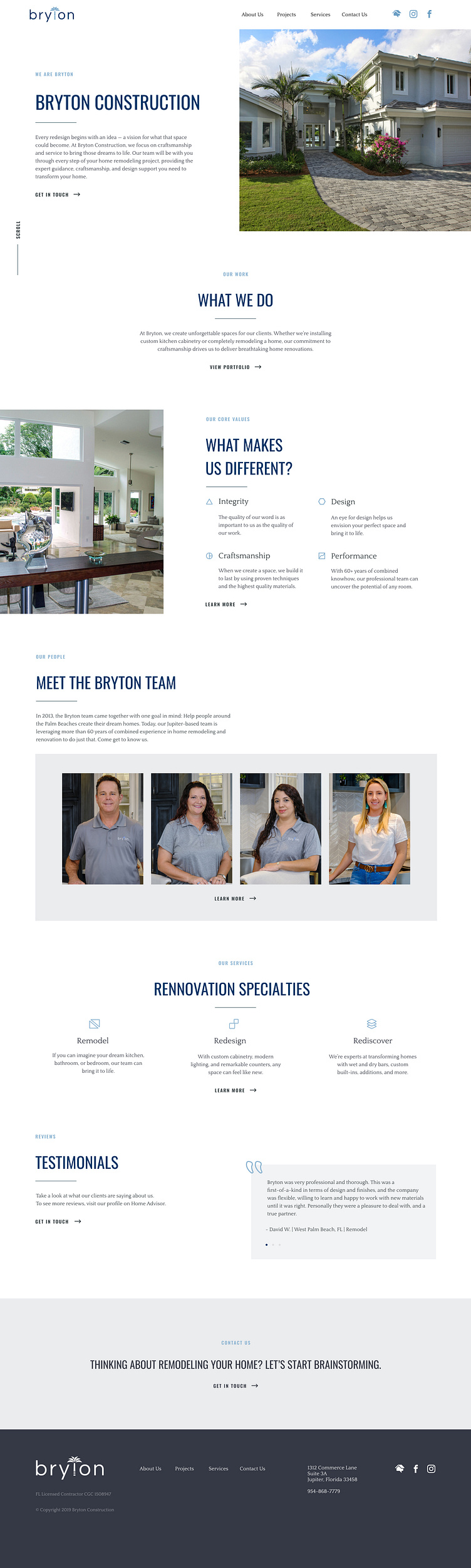
Construction Company Branding, Logo, Website

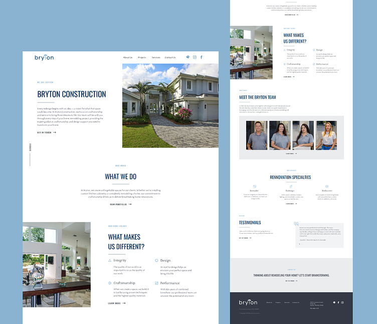
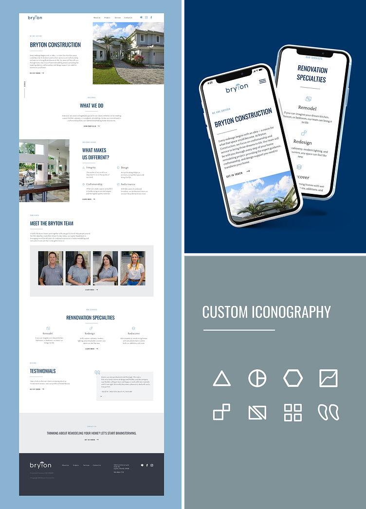
Subtle scroll animations were added to the site to enhance user experience and encourage users to continue exploring the site.
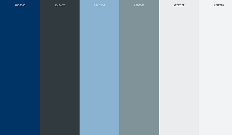
Colors
Bryton wanted their brand to feel approachable, friendly, and reflect the essence of Florida. I paired cool colors with a Palmetto blue and replaced basic white and black with cream and charcoal colors.
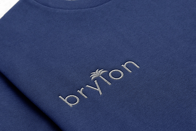
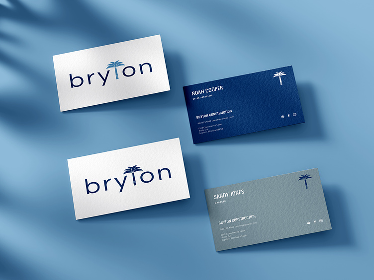
Logo
Brytons new logo was also rooted in their Floridian culture while paying homage to their beginnings in South Carolina.
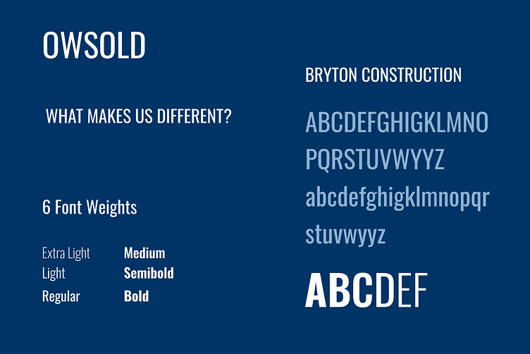
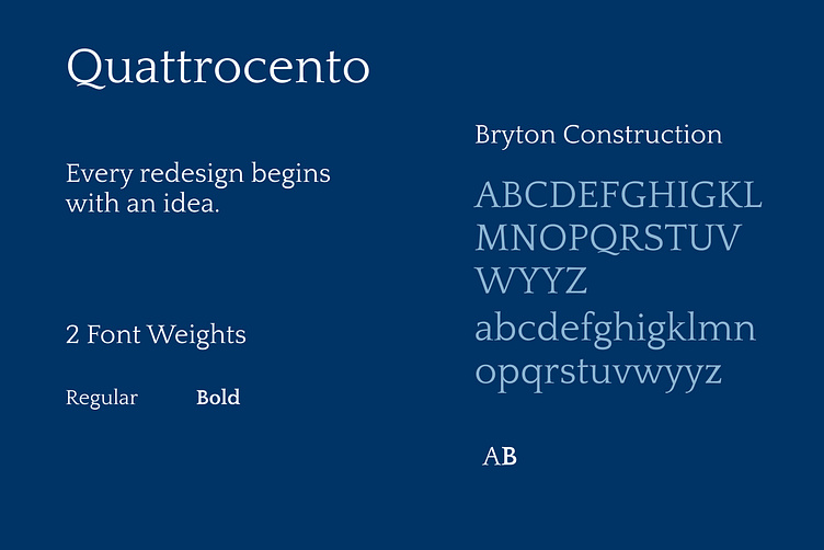
Fonts
Bryton needed fonts that resembled construction and contracting. At the same time, they needed an elevated, sophisticated look to tie into their design and custom project expertise.
For the primary font, I chose a sturdy sans-serif font that reflects a construction business with a modern spin – Oswold. The secondary font is a modern serif to contrast the condensed nature of Oswold – Quattrocento. Together, they offer the perfect balance between hard and soft/build and design.
Visit the live website here