ANARI AI

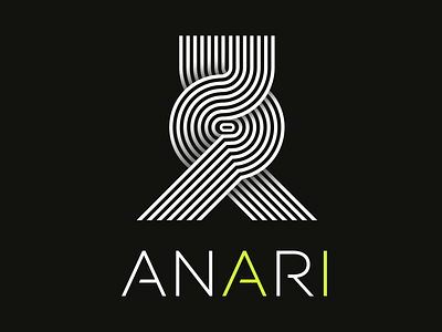
The logo is a stylized upper-case letter A influenced largely by the op-art movement in modern art history combined with the name of the company.
Typically employs abstract patterns composed with a stark contrast of foreground and background - often in black and white for maximum contrast - to produce effects that confuse and excite the eye. It seemed to supply a style that
was highly appropriate to modern society. To many, it seemed the perfect style for an age defined by the onward march of science, by advances in computing,
aerospace, and television. Op art exploits the functional relationship between the eye's retina - the organ that “sees" patterns and the brain - the organ that interprets patterns.
Op art inspired Anari AI's brand identity not just in it’s residing connection of science and art, but also in it’s ability to challenge the viewer with it’s perceptual effect - it causes the eye to detect a sense of movement, where Anari is here
to challenge and create movements and advancements in the hardware industry.