Homepage for YouTube

Design Prompt
Design a homepage for Youtube
Goals and scope
Create a fun user-customisable homepage for a desktop view.
Users
Anyone viewing the YouTube desktop page
Role
Designer
Feature
A desktop view of YouTube's homepage.
Research Process
I looked at seven video sharing and streaming sites, only considering websites(Desktop views)
Step One
The first step was comparing video sharing websites to each other.
I looked at:
Similarities
Differences
Elements of the website design that I liked.
Results.
Similarities.
The website pages all follow the same structure.
They all have:
side panels with navigation to other pages,
a search bar at the top,
the user profile and notifications located in the top toolbar,
they all use a white or light grey background for the web pages.
Differences.
Depending on the website, some sites had:
a long or short navigation list in their side panels,
a cleaner look- having less text on the page or in the panels.
video cards -where all the information of the video was placed in a boundary with less text.
What I liked.
LBRY homepage- I liked their video card design and the prompt they had at the top that gave helpful information to viewers.
YouTube- I liked the sorting filter at the top based on my watching preferences, I also liked that there is some form of structure with what videos you see first even though it is not implied.
Facebook watch- I liked the UI design and the rounded objects compared to the more pointed objects on the other websites. I liked the settings icon at the top of the side panel. I liked that I could see how many new videos my friends had posted.
Twitch- They have "a LIVE right now" section where a viewer can easily flip through all the currently live sessions. I liked this view.
Daily motion- looked organised structurally but, in a disorganised way, I liked how they used different video card sizes and how they tagged their videos into different categories.
Rumble- they had their top video front and centre with a tabbed panel on the side where they gave the viewer watching suggestions. I liked the clean design and the way they grouped their videos.
Design Process
Step Two
I took everything I had learned and put the elements that I liked into a wireframe.
I divided the page into four parts.
The toolbar at the top
The side panel
The centre area with video navigation
The video categories
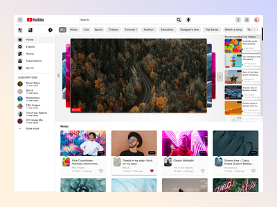
The toolbar at the top. This followed the structure that I saw across the websites. It had the logo, the side panel hamburger icon- where the user could open and close the panel, the search bar and user notification and profile.
The side panel. I decided to go with a less saturated look compared to what Youtube has, I left the first four pages and took the rest and put them in their tab. I pulled the subscriptions list higher up with an addition of how many new videos each subscription had. The logic here is that the subscription with the newest video (as opposed to the highest number of new videos) would be at the top of the list. Finally, in the side panel, the user can easily access settings that would allow them to customise their page even further.
The centre area with video navigation. Below the toolbar is the sort list that I like from Youtube. The first four filters would create categories of videos based on the viewer's most recent watching history. The next filters were based on youtube recommendations based on the viewer’s watch history.
Front and centre would be live videos or recently live videos from the viewer's subscriptions list that the viewer can scroll through and on the side would be the list of recommended live videos that the user can jump to. The recommended list and the subscription list would change back and forth based on the viewer's activity or their current available watch list.
The video categories. The filters at the top of the page determine the categories at the bottom of the page. Each category will have up to 8 videos. The endless scroll will still apply.
Step Three
High Fidelity designs
I worked on each section at a time, using design principles and processes. After a lot of iteration and feedback from friends and family, I designed the final look.
Final look design
The toolbar at the top
I added grey backgrounds to the icons.
I made the elements/object's corners round
The side panel
The navigation page icons have a grey background.
Divided the navigation list leaving in the first 4 and putting the rest into another tab. Added tabs to the navigation panel, then I pulled up the subscriptions list and added: "+new videos" below the subscription name.
I added new navigation called My list- this is a new page, where videos that the viewer likes ❤ ️ can be viewed later.
I added a settings function at the top, here the viewer can access settings to personalise their homepage even more
The centre area with video navigation
the filter list- the different filters have a less rounded design, to keep with the theme of the page the first 4 filters, after ALL, can be selected by the viewer based on their preferences.
The screen is front and centre- the viewer can see video information when they hover over the screen card, they can also react to the video in real-time and can see other people's reactions. They can navigate through the screen cards with the arrows. To the right, there is a list of recommended live videos that are based on viewer-watch history.
The video categories
I added a video card with a noticable outline. The video thumbnail has a small triangle at the bottom that points to the profile picture. This design is replicated in the recommended videos list at the top right.
The categories seen as the user scrolls down the page are based on the filters at the top. Each category has eight videos and endless scroll is applied.