Real Estate - SaaS Web App


Product
Helping investors secure their financial freedom
Work Scope
We were asked by the client to revamp their old/current design in order to improve the user experience and brand recognition. Hence, the design needs to work well on desktops and on mobile devices)
Notes & Motivations
Designing a SaaS architecture that's both straightforward and easy to understand and covers all the nuances isn't easy.
SaaS companies must keep providing options that meet their customers' needs and create a great user experience.
"User experience is what makes or breaks a SaaS product."
Our Solution
We have played around with completely redesigning the user experience.
We have mainly reduced the long-scrolling, which was the system's main pain point and tedious part. How and why? A dashboard is a handy way to visualize data because it makes it easy to analyze, interpret, and compare. Users can't see all the information at once when the information is broken up into independent and separately accessed sections on display. This limits the overall experience and the ability to gain valuable insights. Therefore, placing some out of view can compromise the display's usability when there is a large amount of information. In addition, forcing the user to interact with the display shifts their focus from analyzing and consuming to finding information relevant to their task. The average person can only retain five to nine items in short-term memory for nineteen seconds (Source: www.interaction-design.org). To relieve viewers from remembering information and scrolling, it is essential to arrange the dashboard so that all relevant information is placed close together, so they don't have to interact with it. However, you'll notice we have optimized the user experience by grouping relevant items together. Because gestalt psychology describes the tendency to perceive items as grouped when they share a common region. For example, items within the same delineated region are likely to be grouped together. (We will regularly share more of the main pages where you will find the results of what we are telling here. Because judging one screen won't give you a full picture of our writing.) So, please keep your eye on our dribble page.
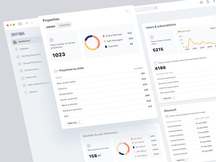
We cleaned up the interface with balanced breathing room and white space. White space helps to focus on certain things. So the user has less distraction and more what they need to read. Therefore, it is essential to use 'white space to separate items or data sets that are not related.
We have removed all the colors that made the interface super busy, so we improved and only kept a few colors with the principle in mind "Less is more." So now, the interface is more about its branding. When/If people recognize and recommend you, then you have a Brand.
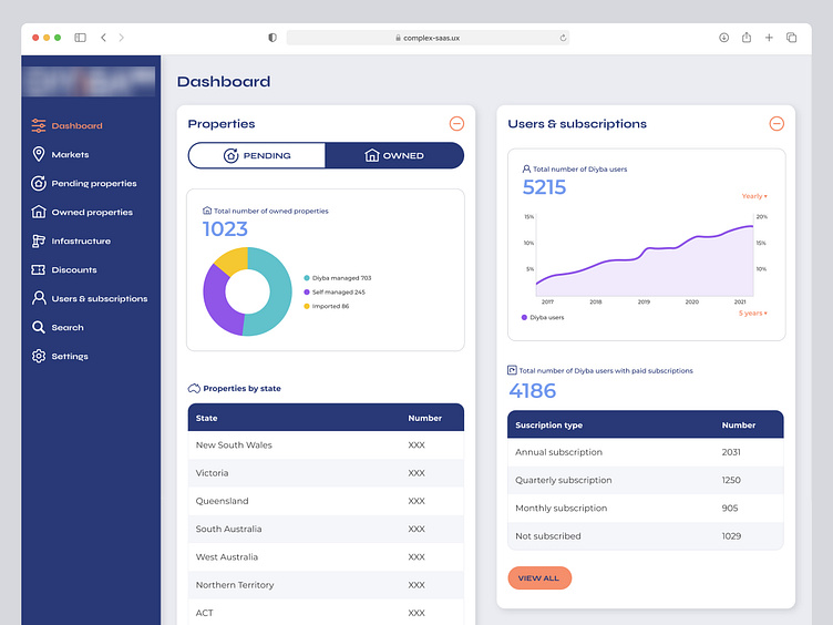
⬇️ ⬇️ ⬇️ Before ⤵ ⤵ ⤵

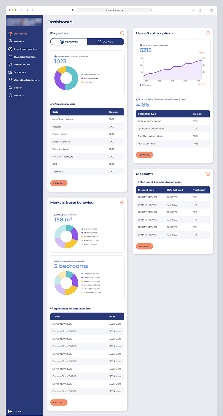
⬇️ ⬇️ ⬇️ Now ⤵ ⤵ ⤵

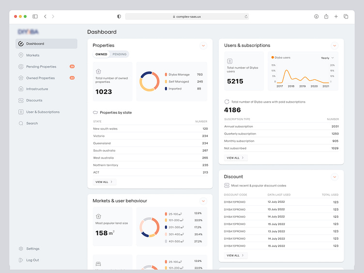
Note: The client approved another design, This is just different version.
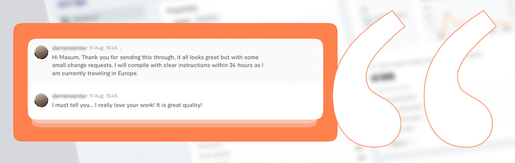
⬇️ ⬇️ ⬇️ First impression, When the client saw the first draft ⤵ ⤵ ⤵
How do we do it?
Communication & strategy are essential to successful design. It's important to collaborate, not to be autocratic. We believe designers fail if they fail to deliver results. High standards and discipline have taught us to view the design process holistically.
--
We design purposefully and have helped several companies develop high-performing, engaging, easy-to-use software solutions by applying our science-backed Behavioral Design Process.
Do you need help too?
Please schedule a time to discuss kindly: