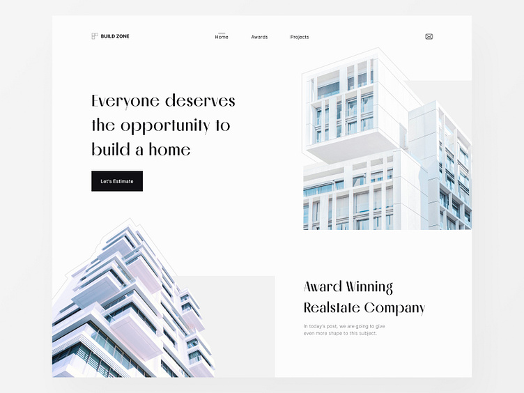
Minimal Realestate Website Header UI UX Design

Let's break down the design
RESEARCH PART (Hypothesis):
👉 Why this design?
There are many people who have lots of money to build a real estate asset but they just want to invest and don't want to take any hassle from it, so this is the company that provides all kinds of services regarding real estate.
👉 Audience of this design?
People who have money to build real estate.
Their Age is between 35-50 both Male and Female.
Minimal and Elegant design suits my audience's taste.
UX PART (nngroup):
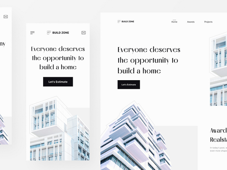
👉 Why is the logo in the left section?
More users remembered the brand name when it was displayed on the left side of the page, rather than on the right side.
BUSINESS PART (Proven method):
USP (Unique selling proposition) and CTA (Call to action) are clear and understandable for increasing the conversion.
UI PART (Principle):
👉 Why are two images and headlines on the opposite side?
This is a part of the design principle called symmetrical balance.
I don't want to make you bored that is why stop explaining here, maybe I will explain new things on any other day inshallah
Feel free to add any suggestions for my improvement in the comment, please.
We are available for new projects
📩 Contact us, We are ready to create something wonderful for you!
🤝 Say hello: hellotaqwah@gmail.com
Follow Us At:
Behance | FB Page | Instagram | Dribbble | Figma
Check Out More Work: