Danya - Dance School

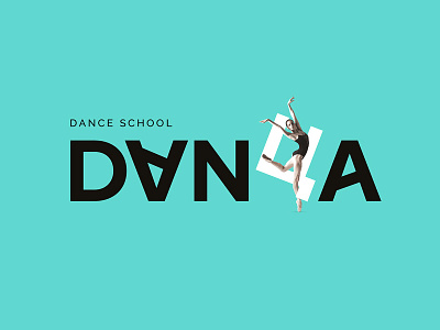
The logo was developed on the basis of a simple laconic grotesque font, but the letter "Y" stands out
from the orderly row of letters — it balances on its tail and betrays the originality of the spelling of the name.
Since there is no such letter in the Latin script, the Russian-speaking public reads the name unambiguously.
Also, the letter "Y" connects the name of the studio and the name of the residential complex, which uses
this letter in the logo.
Dynamics is added to the letters "A" due to the internal stroke, turned at an angle. And the first letter "A"
turned over, supporting the accent "Y" in the dance.
Interested in working together? Reach me on DM or E-Mail :