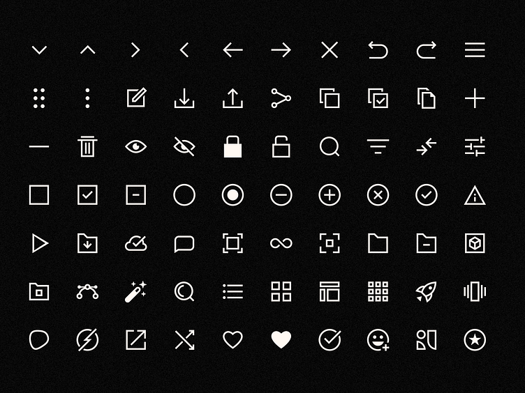
Redesigning Glorify’s icons library

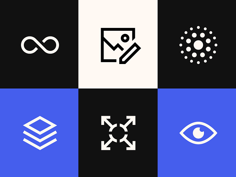
To sync with the retro-futuristic look of Glorify’s latest rebrand, our icons library underwent a major makeover. Every icon was redesigned to create precise, coherent and on-brand elements for our users.
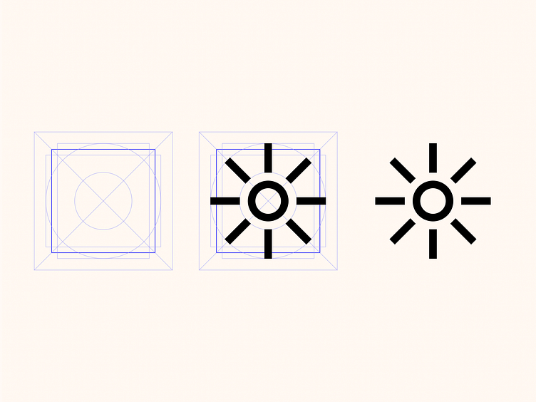
The design system for Glorify icons included keyshapes and orthogonals. Our grid was constructed on a 24 x 24 px key canvas with clean, even measurements to give users on-brand, unique icons for their designs.
Click the link to view the complete process 👇🏼https://www.behance.net/gallery/149187505/Redesigning-Glorifys-icon-library