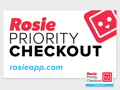
Priority Checkout Sign Revamp

My Role
The original design was one of my first projects at Rosie. When revising our style guidelines, I revised the design for consistency and clarity.
The Problem
Despite its namesake, the Priority Checkout sign felt dated, cluttered, and uninviting. Despite it's large size of nearly 5 feet, customers had trouble spotting the sign as it blended in with its busy surroundings. Ultimately, we needed a cleaner, simpler revision to the first iteration of our Priority Checkout signs.
The Solution
I created a sign that took advantage of white space, highlighting the same elements but giving them room to breathe. The sign is more clear, gives the elegant feel of "priority", and will age much better than its predecessor.
First ver. Mar. 2013, Revision Jul. 2014