Help Me Francis Logo and Branding

Help Me Francis, a financial consulting company, came to me in need of an updated logo to convey how they help clients navigate through the financial maze to meet their goals. Help Me Francis wanted the logo to look professional, vibrant, energetic and friendly.
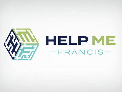
Because Help Me Francis emphasized how they use their expertise to helps client through the financial maze by guiding them through the process, I thought it would be appropriate to incorporate a maze into the logo icon.
The icon uses three mazes on three sides of a cube. The first initial of each word in Help Me Francis is in the center of each maze. The maze symbolizes the clients in need of a consultant to help them navigate through the financial maze of their unique situation. The initial letter in the center conveys that Help Me Francis is the solution to help clients walk through the maze to reach their goals. Using a cube versus flat maze icon gives the logo depth and dimension representing the depth of the services HMF has to offer.
I used a strong, simple sans serif font. Using a simple font keeps the logo looking clean while delivering impact focusing on the icon. The Help Me text uses a bolder font to give it more emphasis. The Francis text uses a lighter font to give it an approachable, friendly feel.
This color scheme uses three colors to give a vibrant, energtic feel while looking stable, professional and capable of delivering expert service.
After the logo was approved, I designed the stationary to match creating a cohesive look and feel.