Industries Spot Illustration
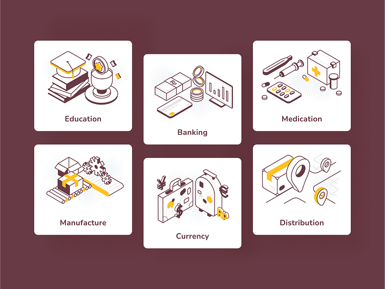
My last year's project for Flip for Business. They had the same style but a different perspective. This aims to maintain a retro with a formal look, intended to feel quiet, serious, and delightful at the same time ✨ what do you think about it? feel free to drop your feedback 🔥
Here are my first iteration sketches :
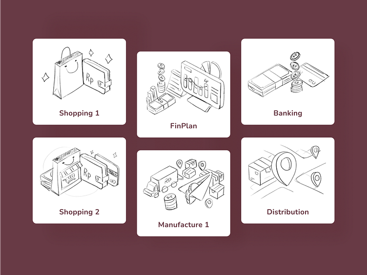
💎 My other shot illustrations with the same style 💎
(for the same company)
Spot Illustration for Verification Steps
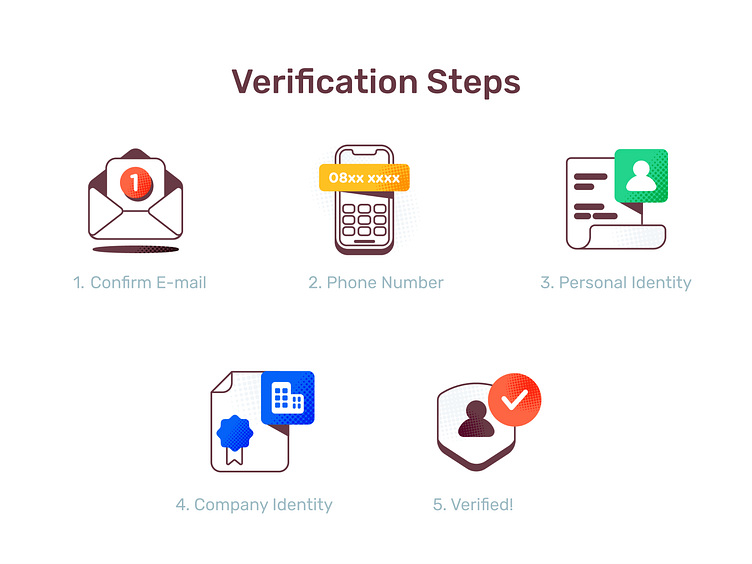
Since the area is limited, I have to use familiar visuals (daily things) to communicate the general message. If users need to confirm their email, tell and show them a literal object. Also, I decided to use bold orange for the verified checklist icon because the primary color of the action button has the same color. The illustration will blend well with the rest part of the UI.
Verification Email

Illustration for remind user to verify their code via e-mail 📧 I tried many iterations to make the composition just right ✨ also the woman looks beautiful, can't remember from whom I took the references but pretty sure I difficult to take my eyes off from her 👁👄👁
Another Not Found Concept
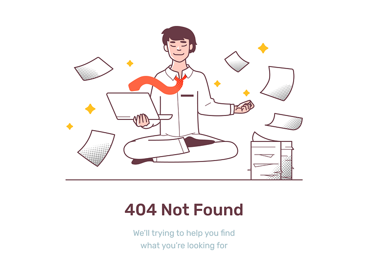
At first this illustration was intended to show at The Not Found page, then turns out the team like it to be an illustration on the Maintenance page 🔧 The concept is to stay calm, relax and no matter what happens just let our team take care of the rest 🧘♀️ 🧘 🧘♂️