Main Squeeze

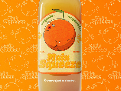
I'm very happy with how the logo has turned out and how natural it looks mocked-up onto a bottle. The colours are warm and bright, yet the greens and beige background along with the grainy texture really help to give it a more rustic, organic feel. The patterned background provides a great setting without taking the focus away from the bottle. The pattern would also be used as part of the brand.