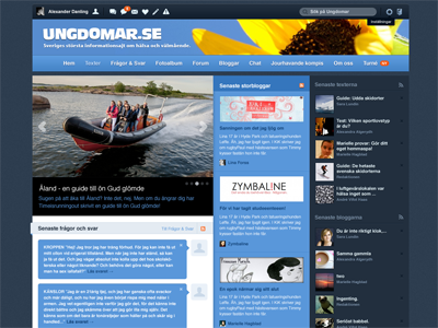
New front page - Ungdomar.se


Need to get some feedback on this. Been starring on this design for far too long to know whether it's good or bad.
The client (Ungdomar.se) wants an updated index page design. No new features or anything (or at least big ones), so what I can change is basically just headers, fonts etc.
Is it too cluttered? How well does the light blue headers in the left column work? Is it too much blue? Please, gimme your best feedback, it's hugely appreciated!