FeatureMap – Project Management Tool Icons


FeatureMap Iconography
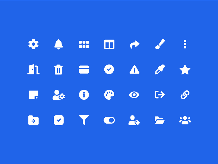
Throughout the app we used solid fill icons, as they are easier to recognize and lead us to better task performance. In addition, we wanted a strong and stable structure and solid fill icons that would contribute to this goal.
We only used outline icons for complex UI elements containing a lot of information. In these situations the icons are informative, inconspicuous, and do not divert attention from the main content.
Check out the case study.