Mabe - Brand Identity

Mabe is a real estate company located in Florianópolis (SC), whose target audience is people with greater purchasing power, offering high-end properties in the most desired parts of the capital, positioning itself in the market in a modern and serious way, aiming for sophistication.
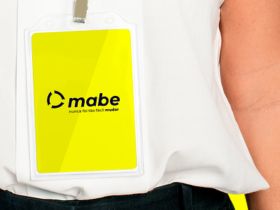
In this visual identity project, the company's slogan was also developed, according to the proposed characteristics and differentials. “It was never this easy to change” is related to the purpose of bringing lightness and care with all the bureaucratic parts related to the customer moving, seeking to provide the best experience in the market.
The creation of the brand's symbol was based on minimalism, combined with the feeling of movement. The symbol is divided into three parts, in order to represent the three owners of the company, united by an empty space in a circle, conveying the idea that, in life, what unites people are invisible and intangible things. The typography of the brand brings the symbology of the wave, to refer, in a subtle way, to the beach area in which the real estate company is located.