Platzi agenda - UX

Problem
We have a huge bounce rate due to people not really understanding what is published in this page. This translates
into a high number of people who miss a lot of our live content, which is critical to complement their learning
experience by interacting live with the community. Platzi’s community represents the heart of the entire Platzi
experience and it is an added value to acquire and retain students. We should leverage these key moments in the
user’s journey.
The page was originally designed to solve a problem that has scaled. It is now insufficient and it also carries a
legacy visual style desperately holding onto production refusing to die. It is old-fashioned and overall does not
support our current needs.
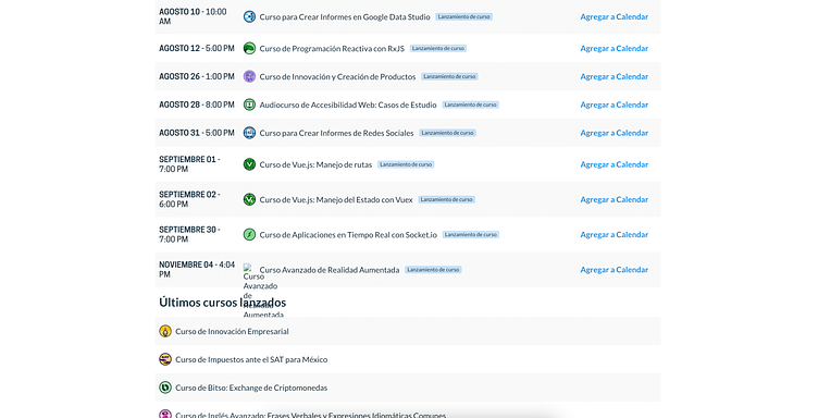
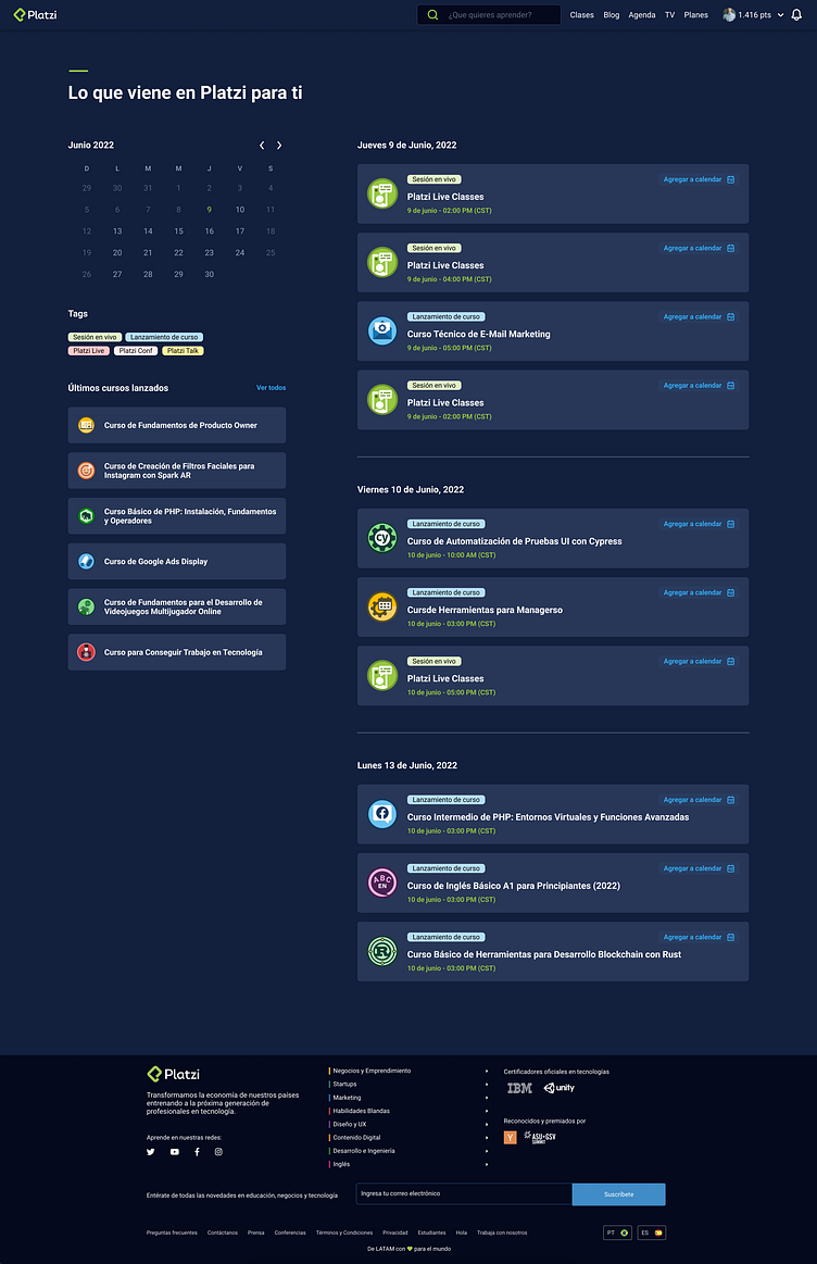
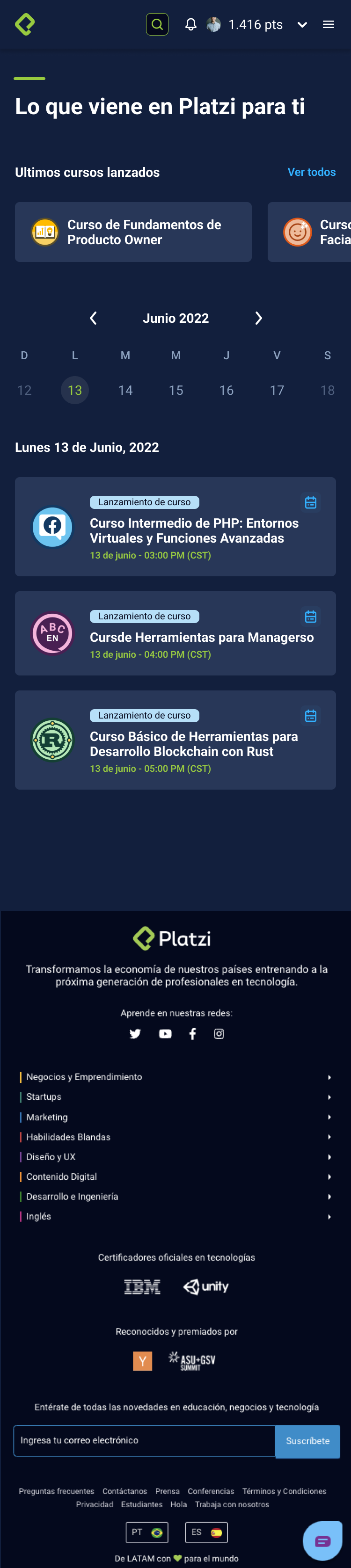
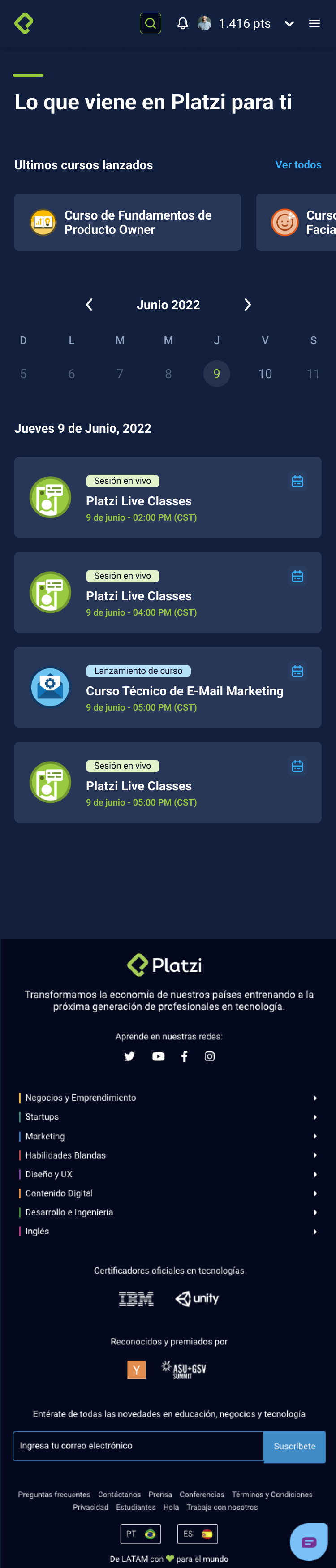
How the problem looks today
The agenda page today looks a bit out of the party.
1. Don't use the same UI style as the rest of the page.
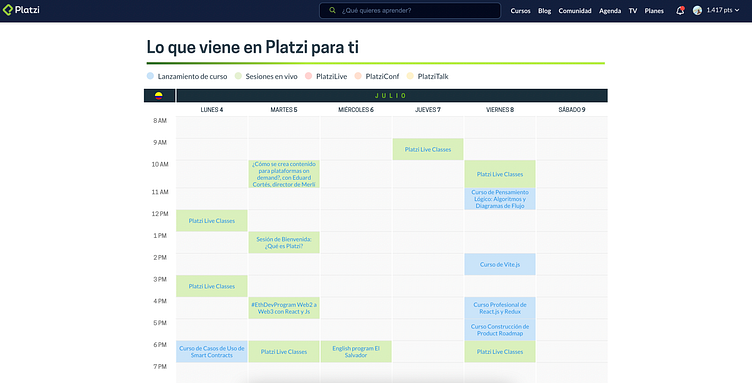
2. The calendar doesn't show all the information that we want to see.
3. They have another section called "Ultimos cursos lanzados" if you want to reach that section, you will need to scroll down almost at the end of the page to see something.
and we can keep going.....
Process of solution
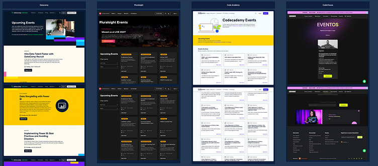
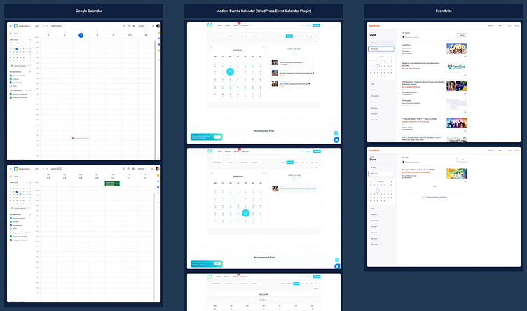
1. Benchmarking
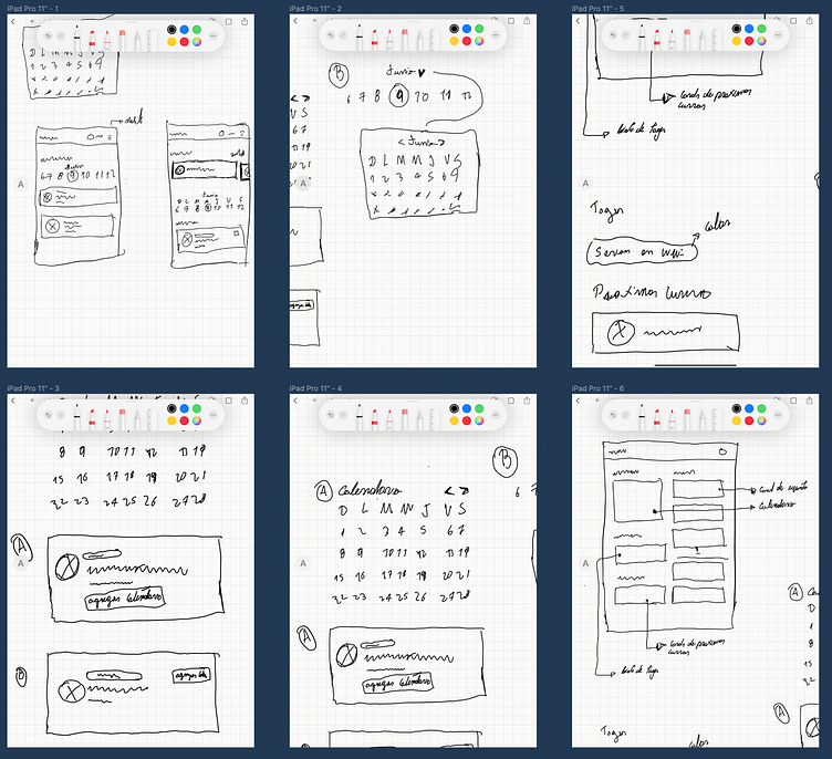
2. Wireframes
3. Solution
Benchmarking
We started analyzing the competence, picking up what it works, and learning about things that don't work very well in the competence.
Wireframing
As usual...... good wireframing it's a good way to clean your design process and have freedom before doing complex things.
Solution
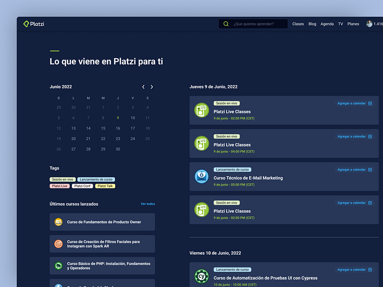
In UX design, we don't have absolute truth, but we can test if something works better than the previous one.
So in this case, we did a bunch of tests with people and they said something in common "now it's easier to find events in the calendar and future events". So we can take it as a positive start.
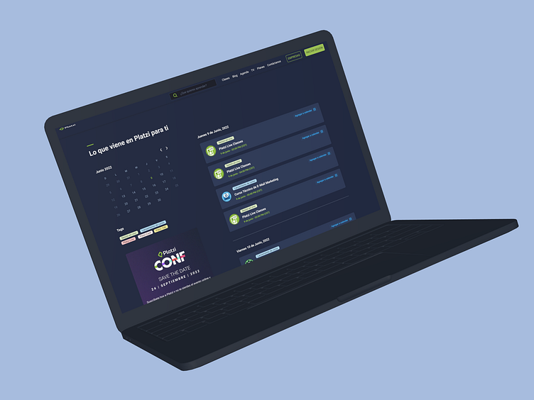
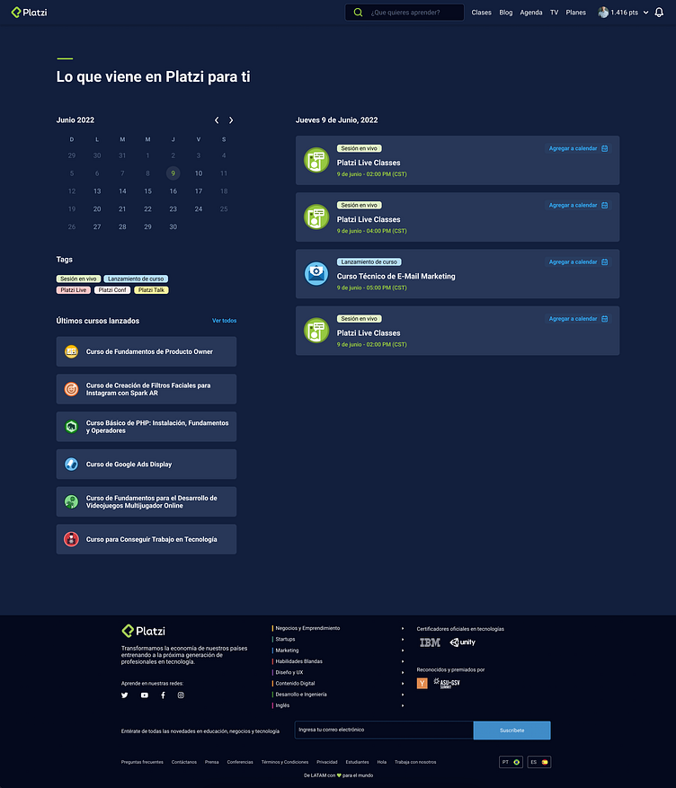
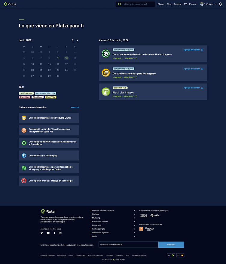
Desktop
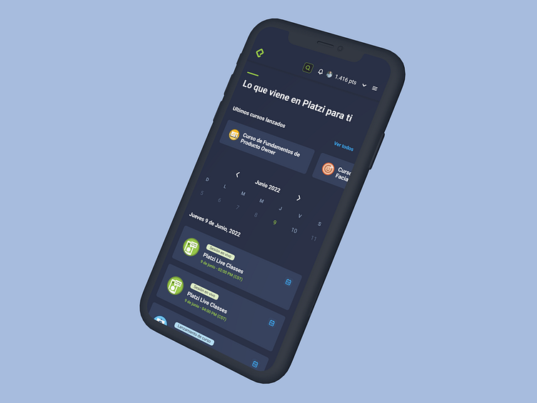
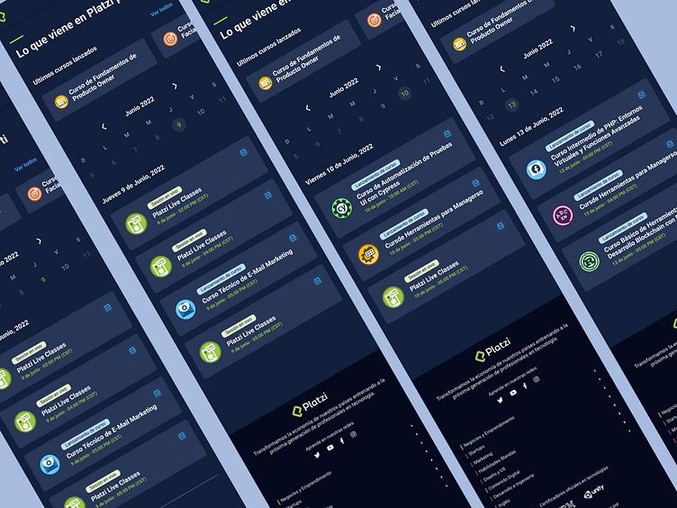
Mobile
Promo images & more