Elsa Energy Logo Redesign - Part 2

Part 2 of Elsa Energy Logo Redesign.
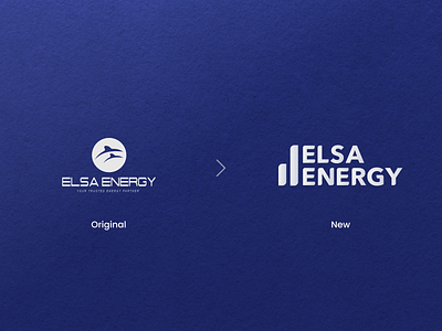
This new redesigned logo is based on Avenir Next typeface which brings more maturity to its brand. As a corporate entity; a bold, confident, and sophisticated persona that remained soft is the key to building trust in a business relationship.
The two pillars next to the wording represent the company's mission, commitment, energy, and strength that consistently get bigger and better.
Let me know what you think 💛
Cheers, Ubai.
Have a project? Get in touch