AGGÁ - Brand Identity

AGGÁ - Engineering Solutions is a company focused on the engineering segment that seeks a modern and differentiated positioning in relation to the market, which is conservative and disputed.
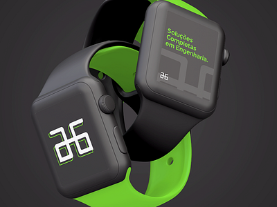
The colors of the project seek to convey a modern and updated image, differentiating itself from the common in the market to be reached. The brand symbol refers to the initial letter H of the name of the owner and founder, followed by the letters A and G, related to the chosen name. AGGÁ is how the letter H is called in Portuguese.