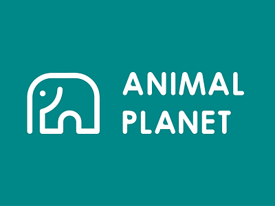
Animal Planet Logo Redesign
I felt that Animal Planet's existing logo was not representative of their brand. The logo looks awkward and cartoonish while the colour blue doesn’t represent the animal kingdom very well.
The idea behind the new logo is to create a simple but iconic logo that displays both the confidence & proudness of the brand as well as it’s gentler, playful side. I selected the greenish-blue colour as it is the perfect amalgamation of the greens of nature and the blues of the seas & skies.
View the full project on Behance.
adobe illustrator
brand
brand design
brand identity
branding
design
elephant
graphic design
graphics
logo
logo design
logo redesign
logo type
typography
View all tags
Posted on
Jun 21, 2022
More by Shruti Rege View profile
Like

