


California Quail & Poppy

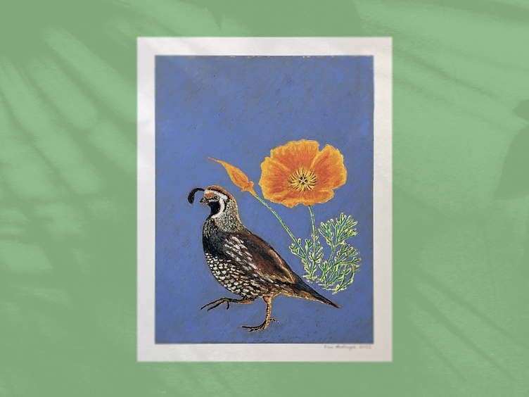
Oil pastel on textured paper. Approximately 9" by 12". I desire to create handmade elements that work in conjunction with graphic design. Below are some shots of the work in progress and my methodology.
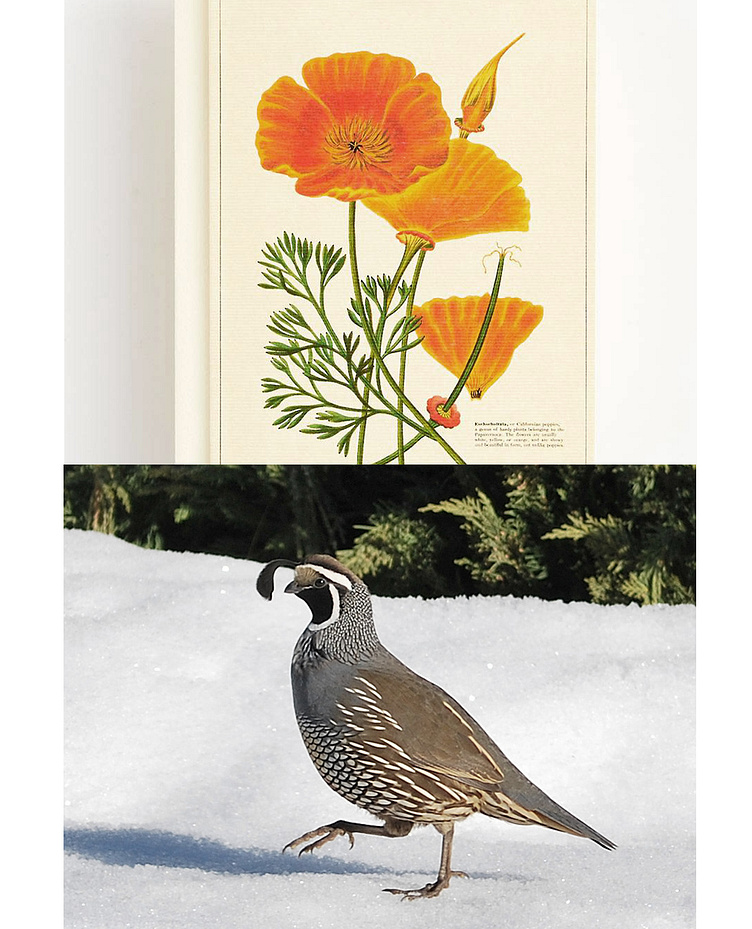
Beginning with an online image search I located the appropriate image references for my project. Vintage poppy illustration from the Cavallini archives. Male California Quail photograph by Carol Riddell.
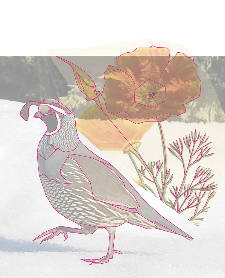
Using Adobe Illustrator I roughly combined the images. Making a new layer on top I drew in some of the basic, essential contour lines to use as my template.
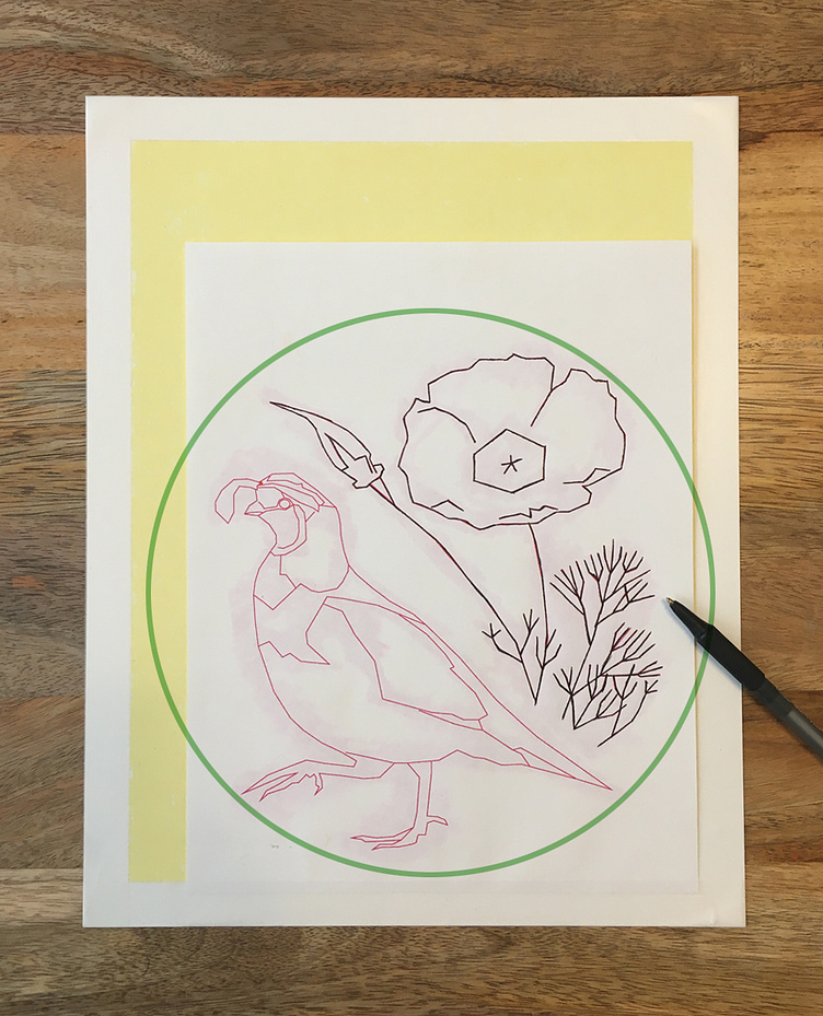
I modified the scale and position of the compositional elements so that they would fill an invisible circle shape (see green outline). I printed out the template on standard letter paper and prepared my final work paper by taping off the borders and applying an even covering of tinted-yellow oil pastel.
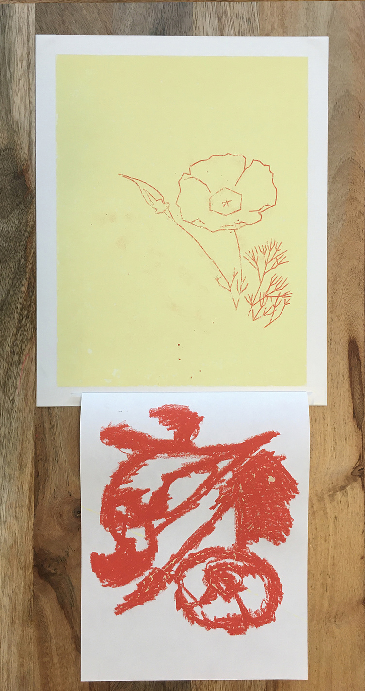
The purpose of this step was to transfer the contour lines of the printed template to the prepared final work sheet. The template was taped into place along one side (the bottom edge). Dark-orange oil pastel was applied to the back of the template - enough to cover the contour lines on the opposite side. In placing the template back over the final work sheet and tracing over the contour lines with a ball point pen, the dark-orange oil pastel lines are transferred to the final work sheet.
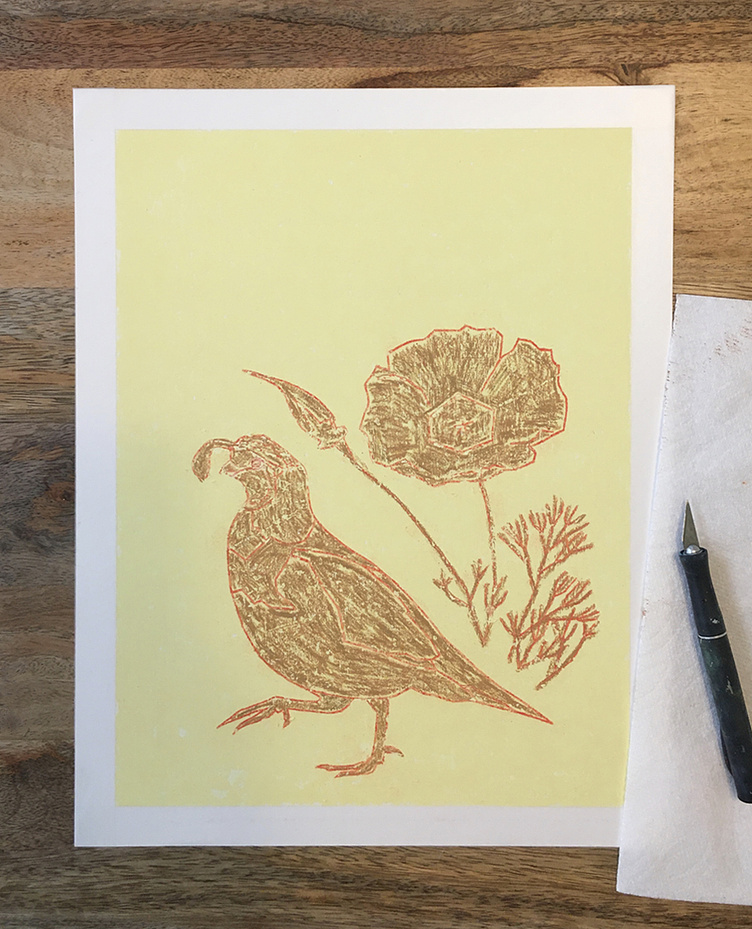
Here I filled in the lines with a neutral hue to begin the process of modeling the forms.
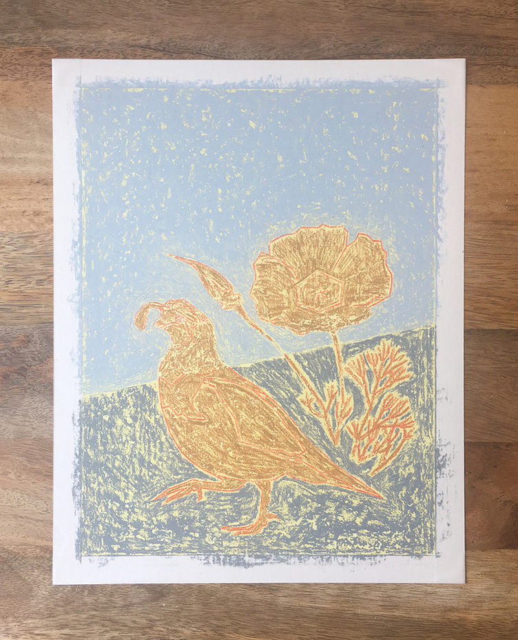
Background colors were then applied in the surrounding negative spaces. Originally I intended to have a diagonal horizon line splitting the composition (which I later changed).
By observing the poppy reference image on my laptop screen I began to further model its form with the appropriate hues, tints and shades. Also at this point I was continuing to build up the concentration of pigments throughout the composition.
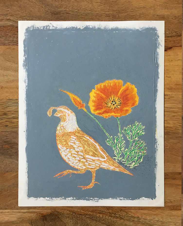
Highlights applied to the quail with negative background space almost fully and heavily pigmented.
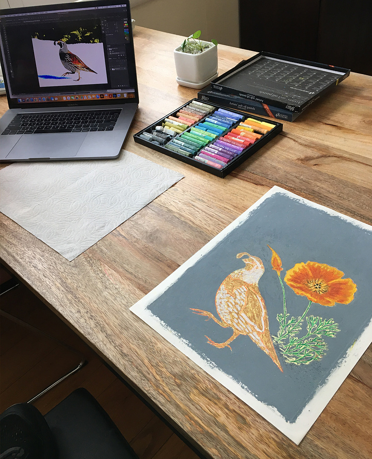
My workspace at the time.

As an aid to observing and translating the pattern on the quail's abdomen I isolated and printed out a portion in black and white. I continued to add a more full range of values to the bird.
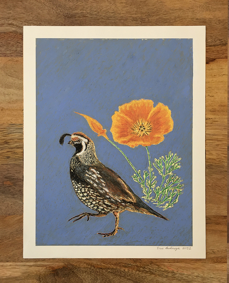
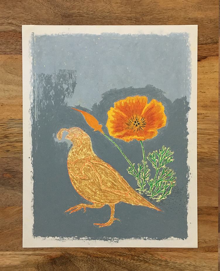
In the final stages of the oil pastel, the quail's modeling is more refined. I desired more color contrast between the quail/poppy and the background, so I modified the background color to a brighter blue, using diagonally angled strokes. The taped border was carefully removed to avoid tearing any layers off of the paper.