TB Moving and Storage Brand Concept

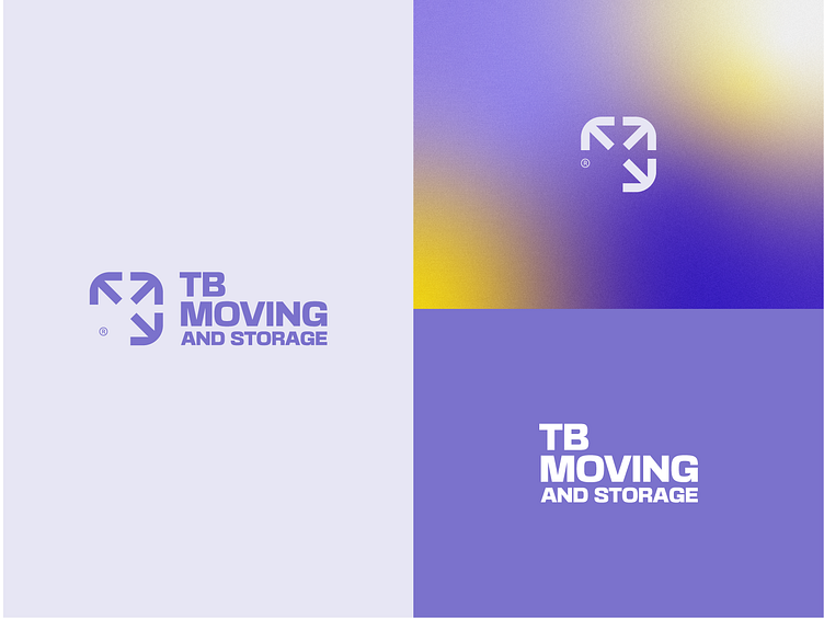
The minimal icon mark is a created by 3 arrows. Every arrow is showcasing some hidden meaning behind itself. Therefore we have a combination of the "Letter T", "Letter B" while creating negative space arrows inside the icon.
Let me know what you think. For new collaboration feel free to reach out via email: - nikoloskidesign@gmail.com