Daily Ui Challenge #2

With the not ending iterations from the evolution of online payments till 2022, credit card payment methods have been through many transitions.
Pulling a credit card from my wallet, entering the card details into a web page, and clicking the ‘Pay’ button has become a pattern that we find pretty similar in every payment layout page.
Things start to change when that webpage squeezes to fit into a 7-inch screen.
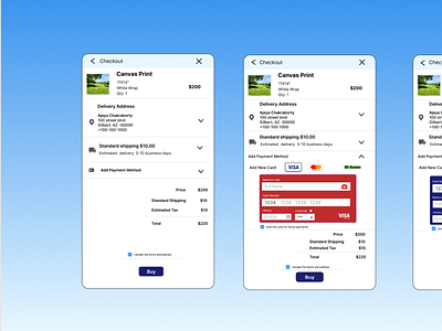
Often while paying on a physical terminal, we look for similar card logo stickers on the swiping machine to be sure if the cards are supported. Similarly placing supported card logos on a visible and not taking extra places.
So, I made the card's logo clickable to be used as buttons. This will allow the user to tap on their respected card logo and a similar card design will pop up. The user will be on a similar card design, and this would make the customers feel comfortable and make the portal simpler to use.
credits @googlephotos @google @googlereferences
Canvas print photo is taken by me